Preview image. Unlock full-res
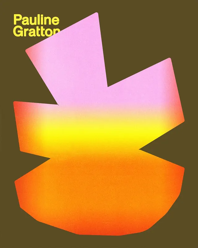
Artist identity for Pauline Gratton featuring abstract organic gradient shapes in pink, orange, and yellow stacked against a warm olive-brown field with yellow nameplate type.
Summary
A designer or artist brand identity featuring three layered abstract organic shapes with smooth gradient transitions from pink through yellow to orange, arranged against a muted olive-brown background with a bright yellow nameplate.
Visual description
Three overlapping amorphous forms compose a dynamic asymmetric arrangement: a tilted pink-to-coral gradient shape at top, a larger multi-step gradient fill running orange-to-yellow in the center, and a smaller curved orange form at lower right. The composition is set against a warm neutral olive-brown field. In the upper left corner, the name "Pauline Gratton" appears in a bold, large-format sans-serif typeface in bright yellow, left-aligned and unornamented. The shapes have soft, slightly irregular edges suggesting organic or hand-drawn forms transformed through digital color blending. The overall effect balances geometric simplicity with color-driven visual interest.
Key takeaway
The harmonic warmth created by layering analogous gradients (pink-to-orange-to-yellow) on a neutral warm background. The approach of treating large abstract shapes as primary visual identity elements rather than pictorial marks. The use of a single bright accent color (yellow type) to anchor text hierarchy against a complex gradient composition.
Reuse notes
Effective for creative-agency or artist branding seeking a contemporary, energetic identity. The gradient approach reads as approachable and modern; pair with minimal sans-serif type for clarity. Works well for portfolios, exhibition materials, or maker identities where visual texture and color are core brand values. Less suited to formal corporate contexts.
More like this


Keep what you find
A free account saves references to boards and can send you a weekly email of picks based on what you save.
To see every result, go Pro.