Preview image. Unlock full-res
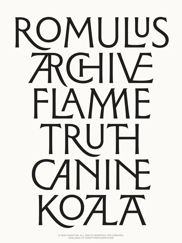
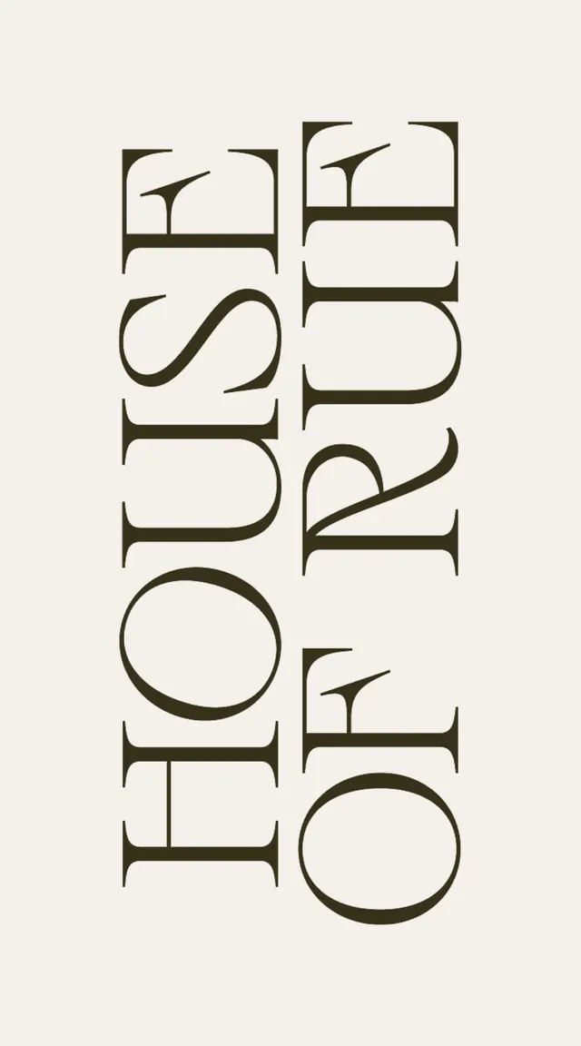
Vertical typographic poster in a high-contrast serif font, with stacked letterforms and generous line spacing on a light background.
Summary
A typeface specimen sheet for Romulus Archive, a serif font displayed in stacked uppercase lines with dramatic vertical emphasis and maximum whitespace.
Visual description
The composition presents the font name broken across seven stacked lines: ROMULUS / ARCHIVE / FLAME / TRUTH / CANINE / KOALA, each in a generous uppercase serif typeface. The serif letters have tall x-height and distinctive open counters, with notable tapered serifs on the stems. The text is centered on a light cream background in nearly black color, with equal spacing between each line creating a rhythm down the page. A small copyright notice and foundry mark (Overtype, overtypefoundry.com) appear in fine print at the bottom right. The overall effect is architectural and spare, letting the letterforms dominate.
Key takeaway
The power of stacked typography at large size with breathing room. The vertical hierarchy forces focus on letter form and texture. The minimal information (type name only) plus generous margins creates a premium, confident presentation. The serif details become the visual ornament.
Reuse notes
Effective for type-forward branding, editorial mastheads, and luxury goods. The high contrast and monochrome approach signals editorial authority and craftsmanship. Works best printed large where serifs read clearly. Pair with body copy in a complementary family to complete brand voice. The sparse layout suits cultural institutions, publishing, and design studios.
More like this





Keep what you find
A free account saves references to boards and can send you a weekly email of picks based on what you save.
To see every result, go Pro.