Preview image. Unlock full-res
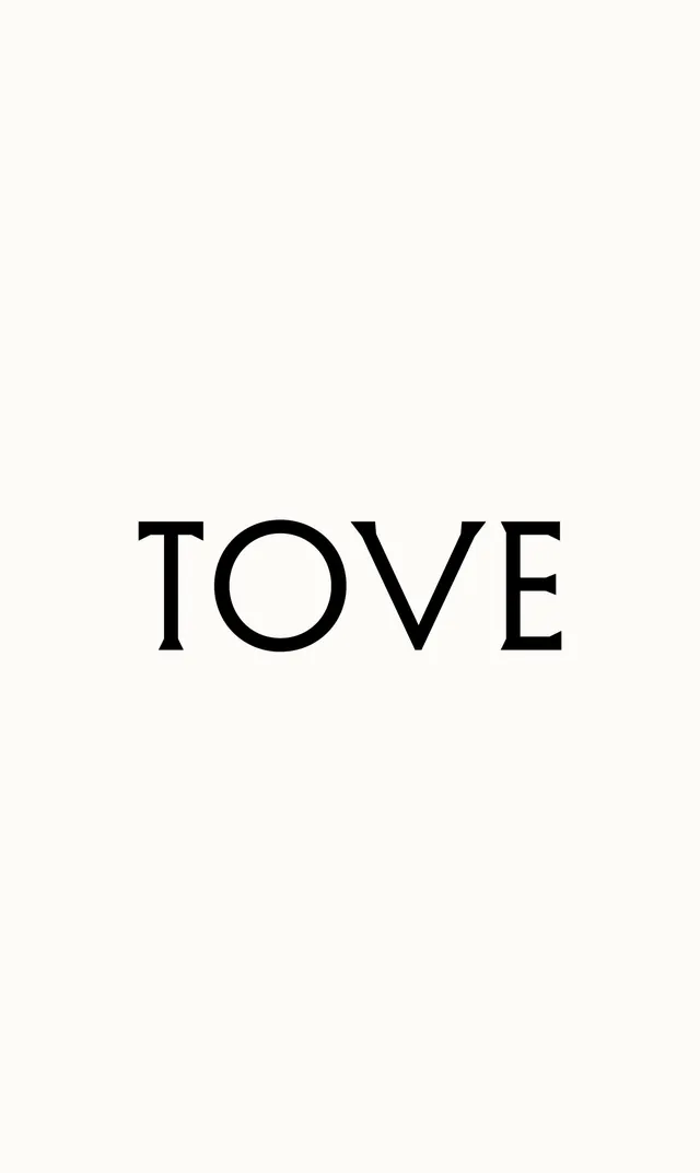
A bold, centered serif wordmark in all-caps positioned in a sea of off-white negative space, emphasizing typographic presence and minimalist restraint.
Summary
A bold, centered serif wordmark in all-caps positioned in a sea of off-white negative space, emphasizing typographic presence and minimalist restraint.
Visual description
The wordmark "TOVE" appears in large, bold all-caps serif type centered horizontally and positioned in the lower half of the composition. The typeface features substantial stroke weight and classical serif proportions, creating visual strength without decoration. The background is a warm off-white or cream tone, providing subtle contrast to the black letterforms while avoiding harsh brightness. Nearly 70 percent of the composition is empty space above and around the wordmark, creating an expansive, gallery-like feel. The precise spacing between letters and the generous margins emphasize the geometric quality of the forms themselves.
Key takeaway
The idea that whitespace and restraint can communicate luxury and sophistication as powerfully as any graphic device. A bold serif typeface in all-caps naturally commands attention and requires no secondary elements to feel complete. The warm off-white background softens the contrast just enough to feel refined rather than stark.
Reuse notes
Ideal for luxury goods brands, editorial publications, and galleries. Best deployed at display scale where the letterforms can breathe and the overall composition can extend into the surrounding space. The all-caps treatment adds formality and timelessness. Works across print and digital when the background is maintained as a solid color field. Pair with sophisticated copy and generous margins to maintain the effect.
More like this


Keep what you find
A free account saves references to boards and can send you a weekly email of picks based on what you save.
To see every result, go Pro.