Preview image. Unlock full-res
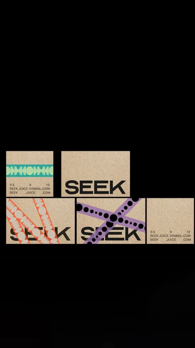
Modular logo system for Seek juice: SEEK wordmark repeated across five kraft-paper cards in bold display type, each overlaid with a different geometric pattern (teal chevrons, orange tessellations, purple dots), with contact info printed small.
Summary
A modular identity system for a juice brand (Seek): the blocky sans-serif SEEK wordmark appears on five kraft-paper cards, each layered with a distinct geometric pattern in teal, orange, and purple, creating a flexible, colorful brand system.
Visual description
Five kraft-colored rectangular cards arranged in a stacked, offset grid layout against a black background. Each card displays "SEEK" in large, bold all-caps sans-serif in black. The wordmark on each card is overlaid or surrounded by a different geometric pattern: the top-left has teal chevrons and a stylized fruit mark; the bottom-left features orange linear tessellations; the center-right shows purple dots arranged diagonally; others use variations of these motifs. Small text in the corners lists contact details (email, phone code). The kraft paper texture and warm neutral base make the bright pattern accents (teal, orange, purple) pop distinctly.
Key takeaway
The modular pattern approach shows how to apply systematic color variations and geometric overlays to a single wordmark without recreating the letterforms, useful for creating flexibility within a constrained system. The bright, contrasting accent patterns on a warm neutral ground give premium-casual appeal appropriate for food/beverage. The stacked, slightly rotated card layout itself is a composition device worth borrowing.
Reuse notes
Strong for beverage, food, or consumer brands needing a playful but structured identity. The pattern system scales well across packaging (labels, bottles), digital, and print. Each card variant works standalone, but the set communicates coherence and personality. The teal and orange palette is energetic without being garish; adjust hues to match brand positioning. Works best with a bold, simple wordmark that remains legible under pattern overlays.