Preview image. Unlock full-res
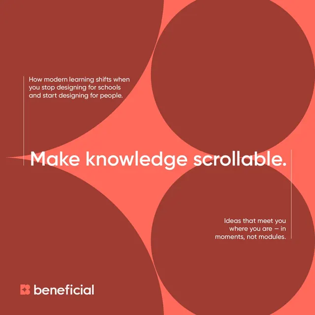
Brand system for Beneficial, an edtech platform, using overlapping red and coral organic circles to frame educational messaging.
Summary
Educational platform branding using overlapping organic circles in warm reds and corals to create depth and frame three distinct value statements about modern learning.
Visual description
Deep burgundy and rust-red background with three overlapping circles in bright coral and burnt-orange tones, arranged to create pockets of negative space. White sans-serif headline "Make knowledge scrollable." floats in the center, with two supporting statements in smaller caps positioned upper left and lower right: "How modern learning shifts when you stop designing for schools and start designing for people" and "Ideas that meet you where you are in moments, not modules." Small white square logo with embedded "B" lettermark in lower left corner, anchored by the word "beneficial." Organic, soft-edged circles soften an otherwise minimal palette, creating warmth and approachability.
Key takeaway
Overlapping shapes in complementary warm tones layering messaging without visual clutter. The three-circle layout guides eye movement naturally across the space. Bold, centered headline with supporting subtext is readable at any scale. The small, refined square logo sits unobtrusive but anchors the brand presence and introduces geometric contrast to the organic circles.
Reuse notes
Strong template for mission-driven or learning-focused brands. The warm palette conveys approachability, energy, and confidence without aggression. Pairs well with light or white backdrops. The organic circle motif works as a recurring pattern in broader systems (headers, dividers, backgrounds). Best suited to touchpoints where three core ideas need equal visual weight.