Preview image. Unlock full-res
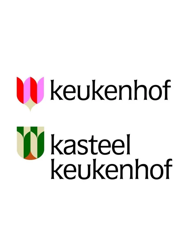
A two-tier logo system pairing geometric tulip-and-crest marks with a soft lowercase wordmark, splitting a main brand from a related sub-brand below it.
Summary
A brand-architecture lockup showing a main "keukenhof" mark above a "kasteel keukenhof" sub-brand. Each pairs a geometric tulip built from rounded petals with a soft lowercase wordmark.
Visual description
Two horizontal logo lockups stack on a white field. The top mark is a stylized tulip formed from rounded petal shapes in bright red and magenta-pink sitting on a small cream base, set beside the word "keukenhof" in a humanist lowercase wordmark with gently flaring terminals. The lower mark reworks the same tulip inside a shield-like crest using forest green and cream with a small rust-orange detail, paired with a two-line "kasteel keukenhof" wordmark in the same type. The petals are constructed from simple arcs and half-rounds, so each mark reads as both flower and emblem. Black type, generous spacing, and a clean baseline keep both lockups calm and legible.
Key takeaway
One petal geometry, recolored and re-cased, generates a whole brand family: the parent runs warm pink-red, the sub-brand shifts to a green heritage crest, yet they are visibly siblings. The rounded-arc petals are a tidy way to draw a recognizable flower without literal illustration.
Reuse notes
A clean model for brand architecture when a parent and a venue or sub-product need distinct but related marks, common in tourism, gardens, hospitality, and retail. Reach for it when you want a friendly, botanical identity that still feels structured. The color shift carries the hierarchy, so keep the petal shapes identical across the family for the system to hold.