Preview image. Unlock full-res
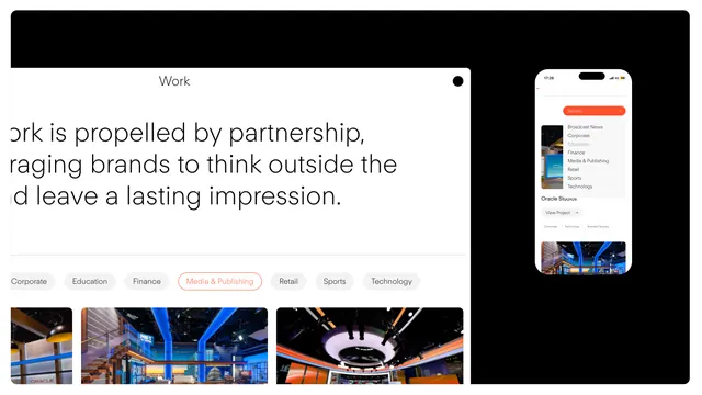
Agency portfolio interface with industry-category tabs, project grid thumbnails, and a phone mockup displaying a featured app or listings screen on the right.
Summary
A portfolio website layout showcasing an agency's work across industry verticals, with a tabbed category system, project thumbnail grid, and a phone mockup of the corresponding mobile app experience.
Visual description
The composition uses a two-column layout: the left side displays text-focused content with a headline ("Work is propelled by partnership...") anchoring persuasive copy. Below are six category tab buttons (Corporate, Education, Finance, Media & Advertising, Retail, Sports, Technology) in a neutral gray-on-white style, with one tab (Media & Advertising) highlighted in orange-red. Three large project thumbnail images are arranged horizontally below, showing architectural and interior design photography with bold colors (blues, oranges, light wood tones). The right column features a centered phone mockup with a light background, displaying what appears to be a listings or portfolio app with preview images and a featured card showing a landscape image with an overlay. A black header bar spans the full width at the top. The overall layout uses abundant white space, sans-serif typefaces, and a restrained color palette anchored by black, white, and orange-red accents.
Key takeaway
The tab-based category system as a lightweight filter mechanism that avoids overwhelming the user while signaling project breadth across verticals. The orange-red label on the active tab provides instant visual feedback. Placing a phone mockup on the right side of the layout demonstrates the responsive design principle and gives viewers immediate context for how the portfolio translates to mobile. The three-image grid below the tabs provides proof points without requiring scroll.
Reuse notes
Strong template for creative agencies, design studios, and portfolios with work across multiple industries. The tab system scales well to 5-10 categories; beyond that, consider a dropdown or sidebar. The phone mockup is most effective when the mobile app mirrors the desktop layout closely. Works on white backgrounds; dark modes require adjusting the gray text and highlight color for contrast. Best paired with strong project photography.
More like this
Keep what you find
A free account saves references to boards and can send you a weekly email of picks based on what you save.
To see every result, go Pro.