Preview image. Unlock full-res
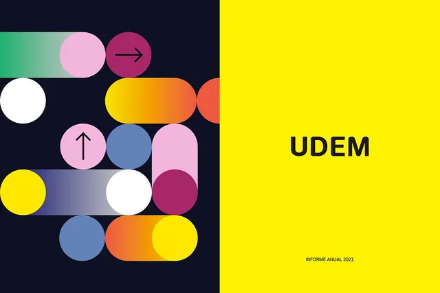
An abstract geometric logo for UDEM's 2021 annual report featuring overlapping circles and rounded shapes in bright yellow, pink, blue, and orange against a dark navy field.
Summary
An abstract geometric mark for UDEM's 2021 annual report, built from colorful circles and rounded rectangles in five bold hues, divided into dark and bright halves.
Visual description
A vertical composition split at the midline: the left half (dark navy, roughly 50% of width) contains overlapping circles and curved shapes in pink, white, blue, yellow, and orange, some with simple vector symbols (an arrow, an up-pointing chevron) nested inside. The shapes are loosely organized in a grid-like stagger without rigid alignment, creating dynamic movement. The right half is a solid bright yellow field with the wordmark "UDEM" in bold, dark sans-serif, positioned right of center, and small text "INFORME ANUAL 2021" in the lower right. The color palette is deliberately warm-cool (hot yellows and oranges meet cool blues and purples), creating maximum contrast and contemporary energy.
Key takeaway
The visual balancing act of complex geometry on one side against clean typographic space on the other, which lets the mark feel both sophisticated and playful. The use of simple geometric primitives (circles, rounded bars) as building blocks makes the logo both scalable and memorable. The high-contrast color split is an excellent technique for annual reports where you want the audience to feel energy and forward motion.
Reuse notes
Strong for tech-forward or creative organizations doing annual reports or brand refreshes that need to signal growth and innovation. The bright yellow-on-navy readability is excellent for print and digital. The abstract shapes may not work as well for industries requiring conservative or trust-based positioning. The geometric approach is versatile enough to extend into a full visual system (icon sets, pattern fills, accent shapes).