Preview image. Unlock full-res
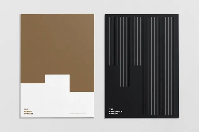
Two distinct corporate identities built on opposing geometric grammars: warm earth tones with abstract cutouts, and stark black with fine vertical lines.
Summary
A two-voice identity system for parallel event brands: one warm-toned and cutout-driven, the other austere and line-based, sharing typographic restraint and structured geometry.
Visual description
Left panel: warm tan background (#876D4D) with a white geometric void carved from lower center, creating negative space as a core identity element. White ground plane anchors small brown-and-white logotype reading "THE AWARDS COMPANY" with supporting text. Right panel: pure black background overlaid with a field of evenly spaced thin vertical lines in light gray/white, creating a dense linear texture. White sans-serif logo reads "THE CONFERENCE COMPANY" at baseline left. Both use identical heavy, condensed display typeface, same white-on-dark color proportion, establishing visual kinship despite radically different surface treatments.
Key takeaway
The paired-identity approach using opposing visual systems (void versus lines) as a way to signal related but distinct entities. Each system is self-contained yet recognizably aligned through typography and color discipline. The simplicity of the geometric move (one uses a carved-out space, one uses repetitive lines) makes both flexible for collateral and signage.
Reuse notes
Ideal for organizations with multiple event verticals or sub-brands needing unified DNA but distinct personality. The approach is particularly strong for awards and conference brands where the contrast in tone reflects different audience expectations. Works well at large scale (signage, posters) and reduces clearly to single applications (business cards, digital).
More like this







Keep what you find
A free account saves references to boards and can send you a weekly email of picks based on what you save.
To see every result, go Pro.