Preview image. Unlock full-res
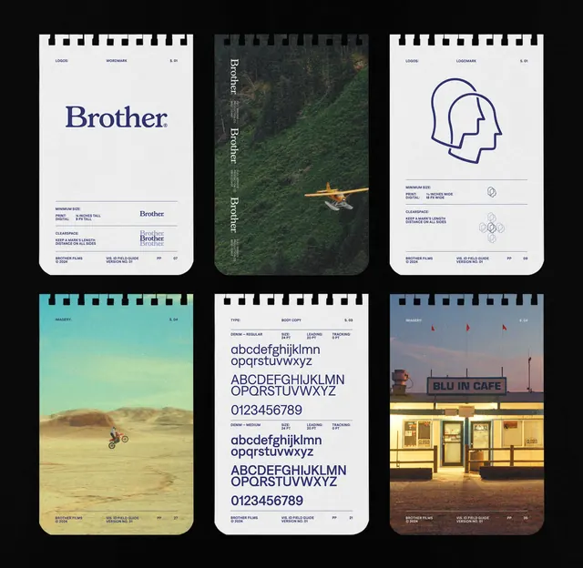
A six-card type specimen showing the Brother brand identity across varied contexts: serif wordmark, environmental photography, geometric iconography, landscape imagery, typeface samples, and storefront signage.
Summary
A six-card type specimen showing the Brother brand identity across varied contexts: serif wordmark, environmental photography, geometric iconography, landscape imagery, typeface samples, and storefront signage.
Visual description
Six rounded-corner white cards arranged in a 2x3 grid against black. Top row: a minimalist "Brother" serif wordmark on white with hierarchical contact info; a tall moss-covered treehouse with muted green tones and vertical branding; a pair of overlapping head profiles in navy outline on white with icon treatments below. Bottom row: golden desert landscape with a small aircraft; a type specimen page showing sans-serif in multiple weights with figures; a warm cafe storefront facade at dusk. Each card carries small-print navigation and credit marks in the corners, maintaining a consistent grid rhythm. Consistent trim tabs at the top unify the set.
Key takeaway
The use of environmental photography and architectural imagery to anchor brand identity rather than relying solely on symbol or color. The six-card grid as a self-contained identity system showing wordmark, icon language, typography, and real-world application in one compact artifact. The deliberate mixing of natural landscape, urban retail, and geometric abstraction to suggest the brand's range.
Reuse notes
Strong reference for B2B or design-service branding that needs to communicate sophistication across multiple media. The format works well as a pitch card, business card, or printed portfolio insert. Best suited to mature, editorial-minded brands. The teal-to-gold color transition is subtle enough for corporate contexts while adding character.
More like this







Keep what you find
A free account saves references to boards and can send you a weekly email of picks based on what you save.
To see every result, go Pro.