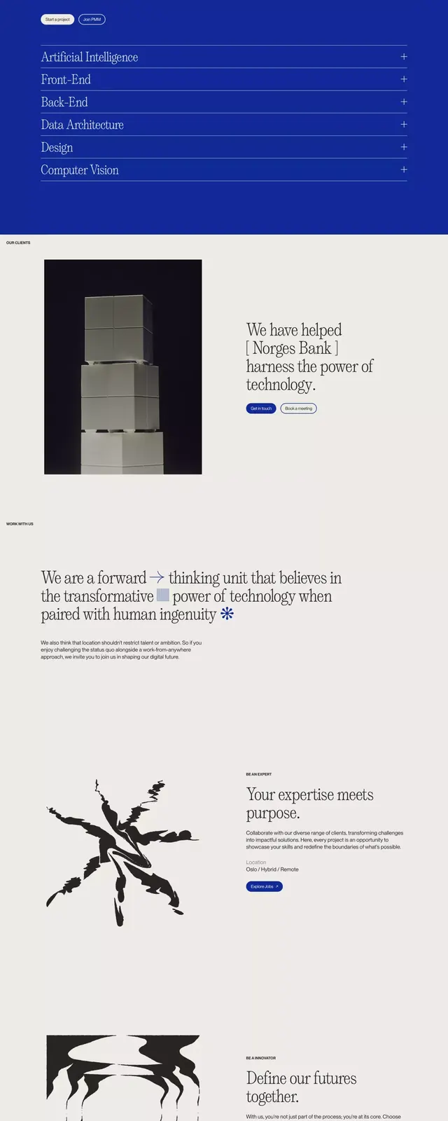
Preview image. Unlock full-res
Minimalist brand guidelines page featuring a typography system with display and body typefaces presented in stark contrast against deep blue and white sections with abstract geometric line-drawn icons.
Summary
Brand guidelines page showcasing typography system and visual language using stark alternation between deep blue and off-white sections, paired with minimal geometric line-drawn icons and sparse body copy.
Visual description
Vertical stack of alternating sections: header in deep royal blue with white display type and small descriptive text, followed by off-white sections containing type samples and geometric icon systems drawn with simple lines, then navy sections with icon families (arrows, geometric shapes, abstract marks), and body copy sections with controlled typography samples. The blue sections contain white serif and sans-serif type samples displayed large. Off-white sections show icon grids in black line. Throughout, generous white space isolates each system element. The icons progress from simple geometric forms (lines, arrows) to more complex organic shapes (botanical, abstract). Display typeface appears bold and slab-like with high contrast.
Key takeaway
Using color shifts (blue to white to blue) as structural dividers that organize content without needing borders or cards. Minimal line-drawn icons as a cohesive system element. Pairing display type at large scale with sparse, elegant body copy. Negative space as a compositional principle, not filler.
Reuse notes
Excellent template for design studios, tech companies, or consulting brands needing serious, contemporary visual systems. The blue-white rhythm is distinctive and works at screen or print. Icon approach is inherently scalable. Assumes good typography available and confident design sensibility.
More like this




Keep what you find
A free account saves references to boards and can send you a weekly email of picks based on what you save.
To see every result, go Pro.