Preview image. Unlock full-res
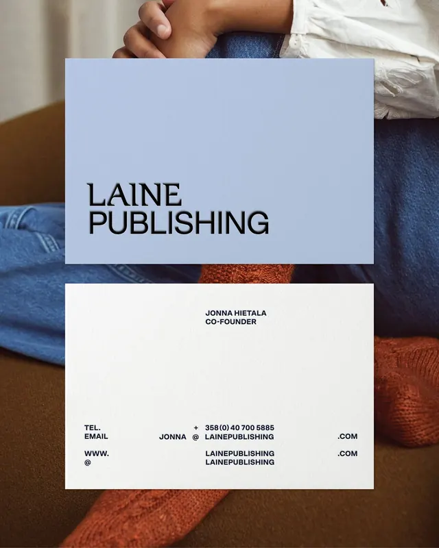
Minimal publishing identity with oversized sans-serif wordmark on periwinkle and cream stationery, paired with photographic imagery of textured fabrics.
Summary
Business card and letterhead system for Laine Publishing, using an oversized sans-serif logotype in all-caps against a soft periwinkle card, with contact information on cream stock.
Visual description
Two stationery pieces shown held over textile background (blue denim, burnt-orange wool). Top card: periwinkle-blue background with the word "LAINE" in bold, oversized black sans-serif, followed by "PUBLISHING" on the line below. Bottom card: off-white/cream background with centered text in small, tight sans-serif reading "JONNA HIETALA / CO-FOUNDER", plus distributed contact details (telephone, email, website) in all-caps using both symbol and word forms. The layout is architecturally balanced with ample white space and a clear visual hierarchy from wordmark down to contact info.
Key takeaway
The discipline of a single, confident logotype scaled large enough to define the entire card proportion. The separation of functional contact info into minimal typographic fragments rather than a dense block. The color story (cool blue + warm textiles) visible in the environment photography adds narrative context without competing with the stationery.
Reuse notes
Strong reference for editorial, publishing, and media-facing identities that lead with typography. Works well when the brand name itself is typographically interesting or condensed. The photographic context (showing the cards in use on textile) is a good model for portfolio presentation of stationery systems.
More like this



Keep what you find
A free account saves references to boards and can send you a weekly email of picks based on what you save.
To see every result, go Pro.