Preview image. Unlock full-res
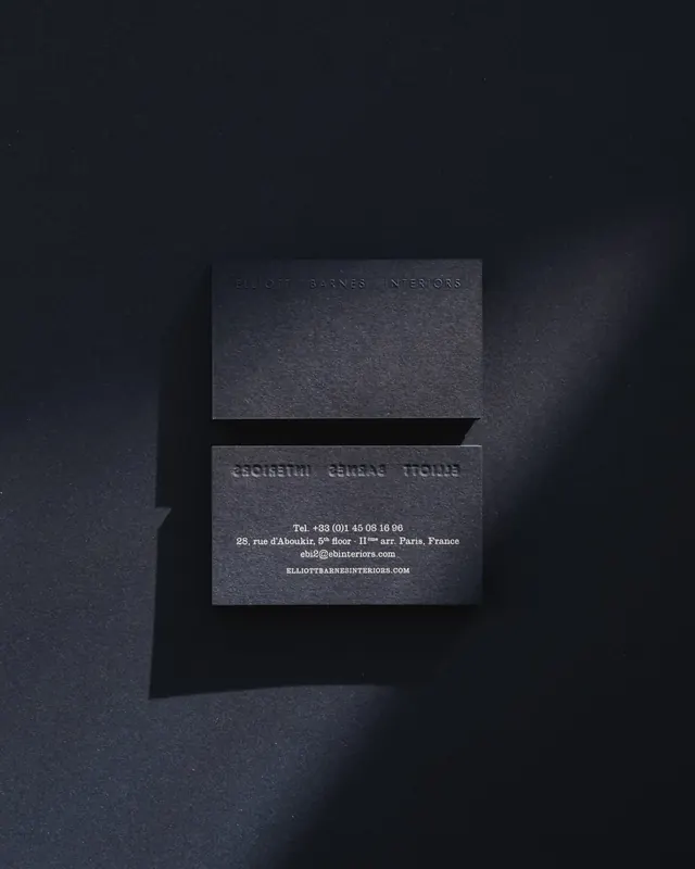
Two black-on-black business cards for an interior design studio, the front face blind-embossed and the reverse printed with white contact details, shot on a deep slate background.
Summary
Two black business cards for an interior design studio, stacked on a dark slate surface. The defining move is the blind emboss: the studio name reads only as a raised, tonal impression catching the side light, with no ink.
Visual description
A near-vertical flat-lay of two matte-black cards on a slightly bluer charcoal ground, lit from the right so a soft cast shadow falls left. The top card shows the front, with the studio wordmark blind-embossed in widely letter-spaced caps across the upper third, legible only as a raised relief. The lower card is flipped to show the reverse, where the same wordmark appears reversed-through as a faint deboss and white serif text sits centered: a phone number, a Paris street address, an email, and the URL in spaced caps. The whole palette stays black-on-black except for that small block of white type.
Key takeaway
Carry the wordmark as a blind emboss on the front so it is felt before it is read, then reserve the only ink (white) for the functional contact block on the back. Photograph tonal stationery under hard raking light so the emboss casts its own micro-shadow and reads.
Reuse notes
Reach for this for luxury, architecture, or interiors identities where restraint signals confidence. It depends entirely on stock and finish, uncoated black card plus a deep blind impression, and on the lighting in the photo. Avoid if the brand needs the cards to scan or read at a glance.
More like this




Keep what you find
A free account saves references to boards and can send you a weekly email of picks based on what you save.
To see every result, go Pro.