Preview image. Unlock full-res
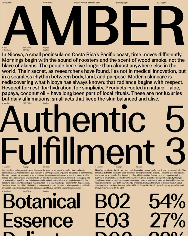
Editorial branding treatment for Nicoya, a Costa Rican wellness brand, using bold black sans-serif headlines over cream and featuring product content blocks with botanical metrics.
Summary
Editorial branding presentation for Nicoya, a Costa Rican wellness line, pairing oversized black sans-serif headline type with warm cream grounds and structured product-metric blocks.
Visual description
Black and cream editorial spread showing "AMBER" in massive display sans-serif across the top. Below, a long-form body paragraph describes Nicoya and its philosophy in narrow justified text, set in a smaller sans-serif. Further down, a three-column layout presents "Authentic Fulfillment 5 / 3" and ingredient/benefit blocks labeled with codes ("Botanical B02 E03") and percentages (54%, 27%, 8%). The palette throughout is restricted to black, cream, and warm neutral tones, with typography anchoring the composition. Fine details include font specifications at the top and small typographic specimens showing weight variations (Medium, Bold, Light).
Key takeaway
The use of a single bold sans-serif headline to establish immediate brand authority; the structured three-column product-metrics grid that communicates ingredient transparency without clutter; the warm cream background that adds tactile approachability to an otherwise stark black-and-white hierarchy.
Reuse notes
Strong for skincare, wellness, and luxury beauty brands seeking editorial credibility. The rigid, content-dense layout works when claims and percentages are central to the narrative. The oversized headline pairs well with tighter supporting text in product- and ingredient-focused presentations.
More like this




Keep what you find
A free account saves references to boards and can send you a weekly email of picks based on what you save.
To see every result, go Pro.