Preview image. Unlock full-res
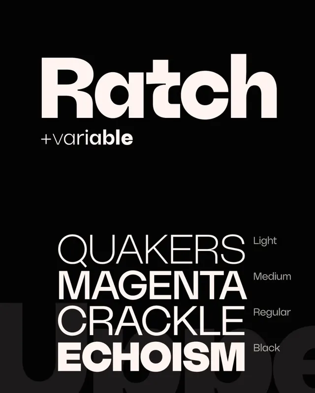
Type specimen for Ratch, a bold geometric sans-serif, showing the font name and four weight variations (Light, Medium, Regular, Black) against pure black.
Summary
Type specimen for Ratch, a bold geometric sans-serif, showing the font name and four weight variations (Light, Medium, Regular, Black) against pure black.
Visual description
The composition uses stark contrast on a pure black background. The wordmark "Ratch" appears in large, bold caps near the top in a nearly white (off-white/cream) tone. Below it, the label "+variable" in smaller, lowercase sans-serif. The lower half displays a stacked vertical stack of sample words (Quakers, Magenta, Crackle, Echoism) in progressively bolder weights, each accompanied by a label (Light, Medium, Regular, Black) aligned to the right. The letterforms are geometric, modern, and clean, with a contemporary quality and generous spacing.
Key takeaway
The discipline of showing a variable font's weight range in a single, readable stack. The near-monochromatic palette (black ground, cream type, gray accent text) lets the letterforms themselves be the focus. The label-per-weight approach makes weight terminology immediately clear and scannable.
Reuse notes
Strong reference for any variable-font specimen or typography-focused branding system. Works best on dark backgrounds. The stacked layout is ideal for web specimens, type foundry pages, or in-house type documentation. The clean sans-serif and minimal treatment suit tech-focused brands and developer tools.
More like this



Keep what you find
A free account saves references to boards and can send you a weekly email of picks based on what you save.
To see every result, go Pro.