Preview image. Unlock full-res
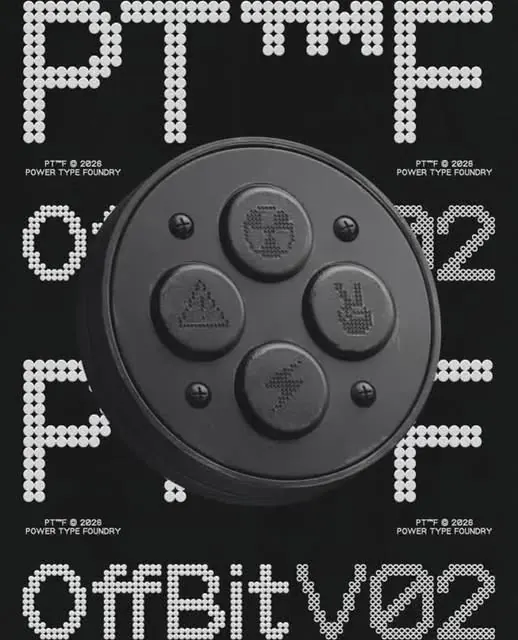
Power Type Foundry specimen for PTF O1 and O2 typefaces, showcasing dotted block letterforms and a central physical embossed device with coin-embossed character matrices.
Summary
Power Type Foundry specimen for PTF O1 and O2 typefaces, showcasing dotted block letterforms and a central physical embossed device with coin-embossed character matrices.
Visual description
A dramatic centered composition featuring large dot-pixel letterforms spelling "PTF O1/O2" in the upper half, with a circular embossed metal device at center (resembling a multi-button control pad or coin press), surrounded by smaller embossed character matrices. The lower half features the full typeface name "outbit VoZ" in matching dotted block letterforms. Crisp white dotted letters on black background, with repeated PTF branding marks positioned at compass points around the device. The metal device has a gray brushed finish with dimensional buttons stamped with small character patterns, creating a physical-digital hybrid showcasing the typeface as both digital display font and embossable character set. Clean high-contrast monochromatic presentation.
Key takeaway
The concept of merging digital letterforms with a physical embossing tool as a specimen presentation. How extreme monochromatic contrast and precise geometric structures make technical typefaces readable and memorable. The visual idea of round-button layouts as character matrices, suggesting input devices or control surfaces. The reputation gained by making typeface presentation itself an object of design, not just type on white.
Reuse notes
Strong reference for foundry branding and technical typeface presentation. The embossed-object conceit works well for mechanical, digit-display, or industrial typeface stories. Appropriate for design-focused brand positioning where the typeface itself is the product. The geometric dotted letterforms suggest retro computing and suggest digital precision without feeling dated. Works best when paired with confident, minimal layout and extreme contrast.
More like this




Keep what you find
A free account saves references to boards and can send you a weekly email of picks based on what you save.
To see every result, go Pro.