Preview image. Unlock full-res
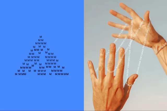
Split-screen conceptual design: left half shows repeating M characters filling a bright blue field; right half displays a human hand with overlaid white text lines emerging from each fingertip.
Summary
Conceptual split-screen design pairing repeating M characters filling a bright cobalt blue field against an open hand with white text radiating from each fingertip on a neutral background.
Visual description
A vertical center line divides the frame. The left half is flooded with a solid cobalt blue, densely filled with stacked white sans-serif M characters in a triangular, pyramid-like pattern that creates texture and visual weight. The right half features a photograph of an open hand against a light neutral-gray surface, with thin white text lines extending outward from each of the five fingertips. The text is small and aligned vertically with each finger, suggesting data flow or information streaming from a touch gesture.
Key takeaway
The asymmetric pairing of pattern (left) and organic form (right) creates visual tension and forces the eye to read them as conceptually related; the M-character pyramid transforms text into a graphic texture rather than readable language; the radiating text lines metaphorically link human gesture to data or communication, a powerful UX/interaction concept.
Reuse notes
Strong for brand materials exploring human-computer interaction, data-driven design, or digital transformation themes. Works particularly well in tech, fintech, or health/wellness brands. The blue-to-neutral color scheme is calm and professional; the hand adds humanity and approachability. Concept reads as fresh in pitch decks and design portfolios exploring gesture-interface or touch-interaction storytelling.
More like this





Keep what you find
A free account saves references to boards and can send you a weekly email of picks based on what you save.
To see every result, go Pro.