Preview image. Unlock full-res
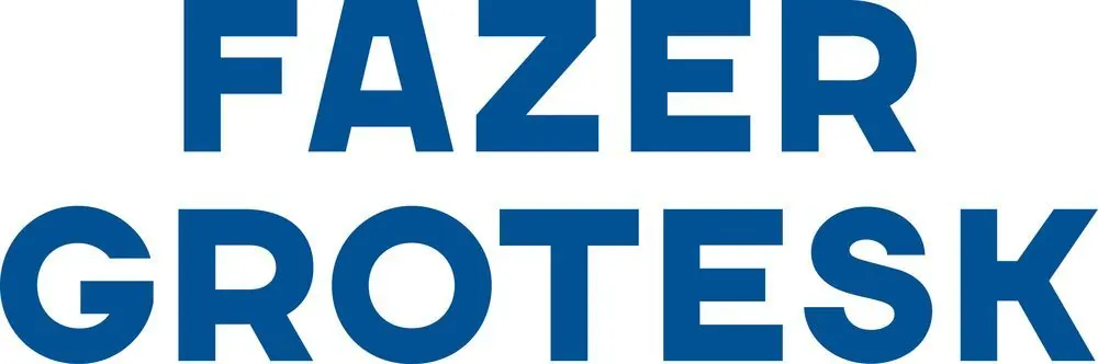
Two-line stacked wordmark in bold, geometric sans-serif, deep navy on white background, minimal and maximalist in its letterforms.
Summary
Two-line stacked wordmark in bold, geometric sans-serif, deep navy on white background, minimal and maximalist in its letterforms.
Visual description
"FAZER" and "GROTESK" stack vertically, rendered in an ultra-bold geometric sans-serif with nearly uniform stroke weight and closed counters. The typeface is distinctive: minimal in ornamentation but maximalist in visual weight and character presence. Deep navy (hex #015294) fills every letterform completely against a clean white background. The layout is centered and symmetrical, with generous letterspacing pushing the words to roughly equal widths. No additional elements, color accents, or stylization; pure typographic statement.
Key takeaway
The wordmark authority comes from the typeface choice itself, not added graphics; bold geometric forms and closed counters create a distinctive visual footprint without complexity; symmetrical stacking and tight letterspacing unify two words into one cohesive mark.
Reuse notes
Strong for corporate, tech, or design-focused brands that want personality through type alone. The stacking makes it compact, ideal for square logos or small-format use. Requires a display-weight geometric sans; works best with ample negative space around it. The deep blue lends trustworthiness and stability; less suitable for playful or warm brands.
More like this




Keep what you find
A free account saves references to boards and can send you a weekly email of picks based on what you save.
To see every result, go Pro.