Preview image. Unlock full-res
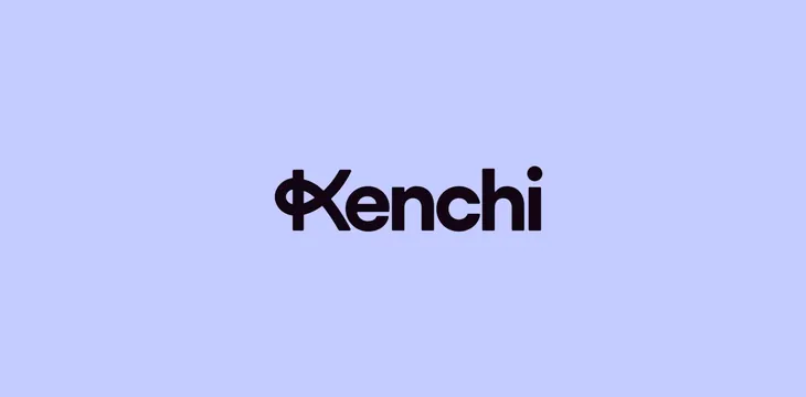
Clean geometric wordmark in bold sans-serif with a distinctive symbol replacing the letter K, centered on a soft periwinkle background for minimal, modern brand identity.
Summary
Wordmark for Kenchi featuring a bold geometric sans-serif with a distinctive custom symbol monogram replacing the K, asserting a modern, understated brand identity through typography-first design.
Visual description
Soft periwinkle background (#C4CBFF, nearly 50-50 fill). Centered horizontally and vertically is the wordmark "Kenchi" in a heavy, modern geometric sans-serif, colored in deep charcoal-black (#0E000C). The K is replaced by a geometric symbol: an overlapping or interlocking mark that combines abstraction (possibly suggesting interconnection or movement) while maintaining the same weight and proportion as the letterforms. No other elements, no tagline, no supporting mark. Composition is purely centered and symmetrical, emphasizing the mark itself.
Key takeaway
The symbol-replaces-letter approach creates immediate distinctiveness without graphic complexity; the single-color, high-contrast treatment (near-black on pale cool purple) ensures clarity across applications; and the geometric sans-serif weight gives tech and consulting credibility while the soft background keeps it approachable.
Reuse notes
Strong starting point for tech, consulting, or creative service brands seeking understated sophistication. The color contrast is excellent for digital and print. This approach scales well to badges, favicons, and embroidered logos. Works best with supporting fonts that have similar geometric clarity. Best used when the symbol has genuine meaning to the brand (not purely decorative).
More like this




Keep what you find
A free account saves references to boards and can send you a weekly email of picks based on what you save.
To see every result, go Pro.