Preview image. Unlock full-res
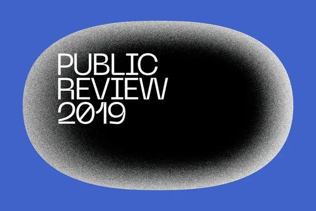
Monochrome wordmark set inside an elongated oval shape with grayscale texture, anchored against a saturated blue background.
Summary
White sans-serif type centered in a textured grayscale oval, positioned against a saturated royal blue background, suggesting editorial or institutional publishing.
Visual description
Bright blue background with a dominant elongated oval shape rendered in grayscale with subtle grain or noise texture. Inside the oval sits "PUBLIC REVIEW 2019" in white sans-serif, centered horizontally and vertically. The typeface is clean and modern. The texture of the oval creates depth and visual interest, suggesting printed or embossed treatment. No additional color, no supporting graphics.
Key takeaway
The containment strategy of nesting type inside a textural geometric shape, which creates a cohesive badge or seal. The grayscale-on-color approach is economical and reads well at any scale. The texture adds tactile interest without clutter.
Reuse notes
Effective for academic, publishing, or media identities that need formal authority. The oval reads as a historical or institutional mark. Works well as a seal, stamp, or secondary mark. The color contrast ensures legibility in digital and print.
More like this





Keep what you find
A free account saves references to boards and can send you a weekly email of picks based on what you save.
To see every result, go Pro.