Preview image. Unlock full-res
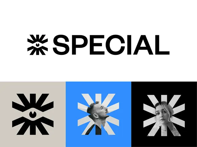
Bold sans-serif wordmark paired with a starburst icon, shown in three colorway variations: neutral gray, bright blue with photographic inlay, and inverted monochrome.
Summary
A geometric wordmark and starburst icon system rendered in three colorway versions: neutral gray, bright blue with human portraiture, and inverted monochrome on black.
Visual description
The wordmark SPECIAL sits above three icon treatments of a radial starburst mark. Left panel shows the icon in solid black on light gray. Center panel features the same starburst geometry in white rays against a bright cobalt background, with a grayscale close-up of a human face positioned at the center of the rays. Right panel inverts the center treatment: white rays on solid black with a grayscale face. The composition is horizontally aligned, balanced in weight. The typeface is a condensed, geometric sans-serif with tight letter-spacing, all uppercase.
Key takeaway
The starburst icon design is modular across backgrounds and colorways without losing clarity. The strategy of pairing a portrait inlay in the geometric mark adds personality to an otherwise minimal symbol. The juxtaposition of human imagery against pure geometric shapes creates visual tension worth saving.
Reuse notes
Suits professional services, tech, or creative agencies. Strong for wordmarks paired with abstract supporting marks. Works best with high-contrast backgrounds; the bright-blue + portraiture version reads well in social and marketing contexts where personality matters.
More like this




Keep what you find
A free account saves references to boards and can send you a weekly email of picks based on what you save.
To see every result, go Pro.