Preview image. Unlock full-res
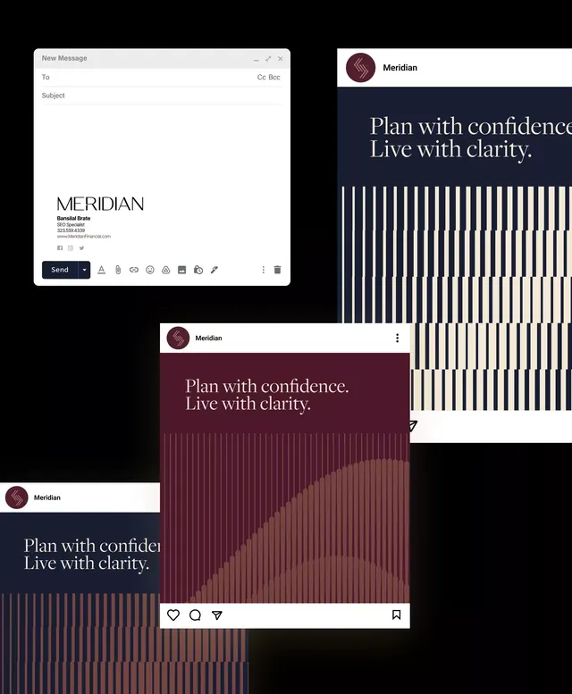
A luxury wealth management brand identity system for Meridian built on a deep burgundy and navy palette with a geometric stripe pattern and serif typography.
Summary
A premium brand identity for a wealth management firm built on deep burgundy and navy, with a signature vertical stripe pattern and supporting typography hierarchy across email, web, and corporate applications.
Visual description
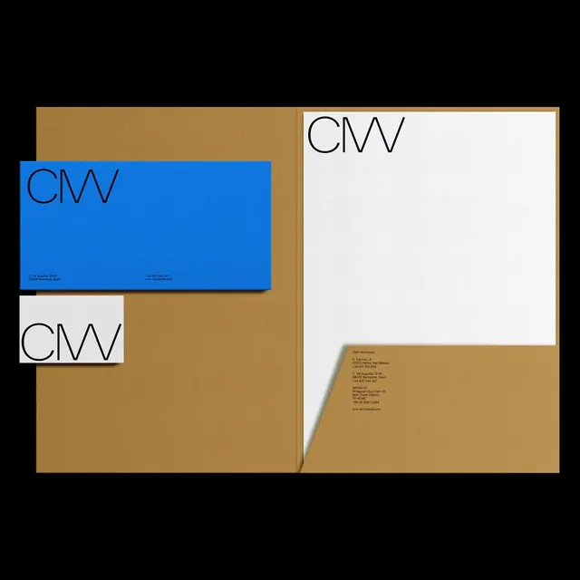
A series of brand applications layered together on a black background. The primary mark is a simplified curved serif form in burgundy sitting atop the wordmark "Meridian" in bold sans-serif. The tagline "Plan with confidence. Live with clarity." appears in a serif font at a larger display size, positioned on solid-color backgrounds (deep burgundy or navy). A vertical stripe pattern fills lower sections, graduating from white to darker tones, creating depth and movement. Email UI, social card mockups, and web hero sections show the mark placement (top-left positioning), typography hierarchy (large serif headlines, small sans-serif body), and color application (burgundy backgrounds, navy sections, cream overlays). Contact information uses a reduced sans-serif type on cream. All applications maintain high contrast and clear hierarchy between the geometric mark, wordmark, and supporting type.
Key takeaway
The vertical stripe pattern as a flexible, scalable texture that reinforces brand sophistication without being literal. The deliberate color separation between sections (burgundy for primary CTAs, navy for secondary) that guides the eye and aids readability. The two-typeface system where serif conveys heritage and confidence while sans-serif ensures clarity in body and UI copy.
Reuse notes
Excellent for financial services, wealth management, or professional B2B brands where sophistication and trustworthiness are essential. Works particularly well in print applications (business cards, letterhead, annual reports) and dark-mode digital interfaces. The stripe pattern can adapt to other vertical or grid orientations. Avoid on very small scales where the stripes become a visual blur; the mark needs adequate space to breathe.
More like this






Keep what you find
A free account saves references to boards and can send you a weekly email of picks based on what you save.
To see every result, go Pro.