Preview image. Unlock full-res
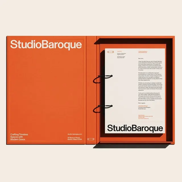
A branding guide for StudioBaroque using burnt-orange folder covers with black metal rings, white interior letter on cream stock, and tagline 'Crafting Timeless Spaces with Modern Grace.
Summary
A branding system for StudioBaroque using a distinctive burnt-orange folder cover, black hardware binding, and cream-and-white interior pages with a strong serif mark and supporting typography.
Visual description
A two-page open book presentation: the left cover shows "StudioBaroque" in a large sans-serif headline in white against burnt-orange, with a tagline below in smaller type and contact information. The right page sits in a black frame on the burnt-orange background, showing a cream letterhead with orange-and-black accents, address block, and body copy in a serif typeface. Black metal rings bind the folder visibly. The identity uses high contrast (orange, black, cream, white) with clear typographic hierarchy and modernist spacing. A small linear element (bar or icon) in orange repeats as a mark.
Key takeaway
The burnt-orange/black/cream three-color restraint (no gradients, no secondary hues). The binding hardware as a visible branding gesture (not just functional, but design-forward). The serif/sans pairing for hierarchy (display sans headline, serif body). The tagline "Crafting Timeless Spaces with Modern Grace" sits above the logo, not below, making the intent explicit and ownable.
Reuse notes
Works for design studios, architects, agencies, and craft-focused consultancies. The warm color palette reads as premium and approachable (not sterile). The binding and folder format suit a service-based business handing out a physical guide. Best with actual tagline clarity and not just visual systems.
More like this






Keep what you find
A free account saves references to boards and can send you a weekly email of picks based on what you save.
To see every result, go Pro.