Preview image. Unlock full-res
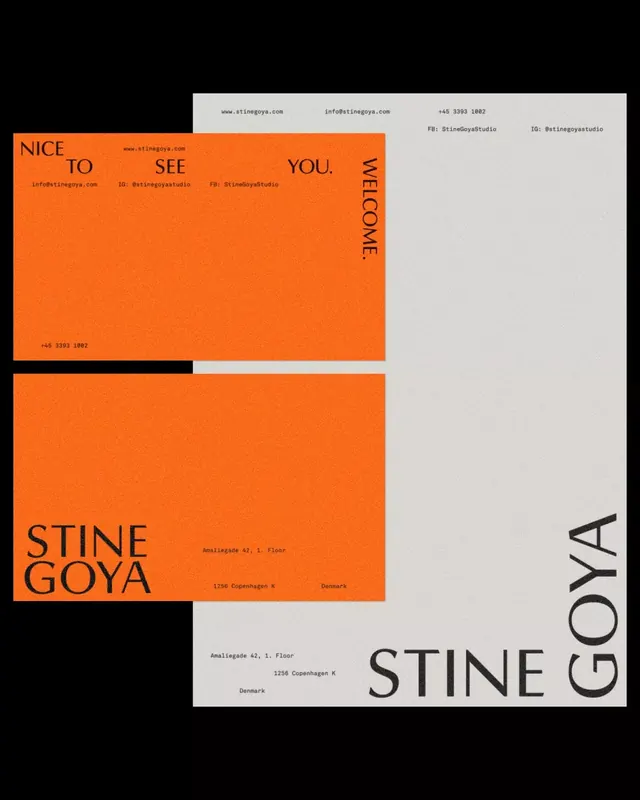
A modular color-blocking typography system alternating burnt orange and white panels to spell out greetings and a brand name across asymmetrical rectangular segments.
Summary
A modular color-blocking typography system alternating burnt orange and white panels to spell out greetings and a brand name across asymmetrical rectangular segments.
Visual description
A composition of rectangular color blocks in burnt orange, white, and black arranged in an irregular grid. Text fragments in a geometric sans-serif typeface are distributed across the blocks: "NICE TO SEE YOU" and "WELCOME" read horizontally across the upper portion, while "STINE GOYA" is rotated vertically along the right edge. The letters are letterforms are set in black sans-serif with generous character spacing. The layout breaks the grid intentionally with overlapping rectangles that shift weight and create visual tension.
Key takeaway
The deliberate asymmetry of color and text placement that still reads as cohesive branding; the warm, high-contrast palette that signals hospitality and approachability; the modular system that can be rearranged or extended.
Reuse notes
Excellent for fashion, hospitality, or creative-services brands seeking a sophisticated yet inviting identity. The warm tertiary palette softens what could be severe geometric treatment. Works across stationary, digital, and environmental applications where modularity is a strength.
More like this


Keep what you find
A free account saves references to boards and can send you a weekly email of picks based on what you save.
To see every result, go Pro.