Preview image. Unlock full-res
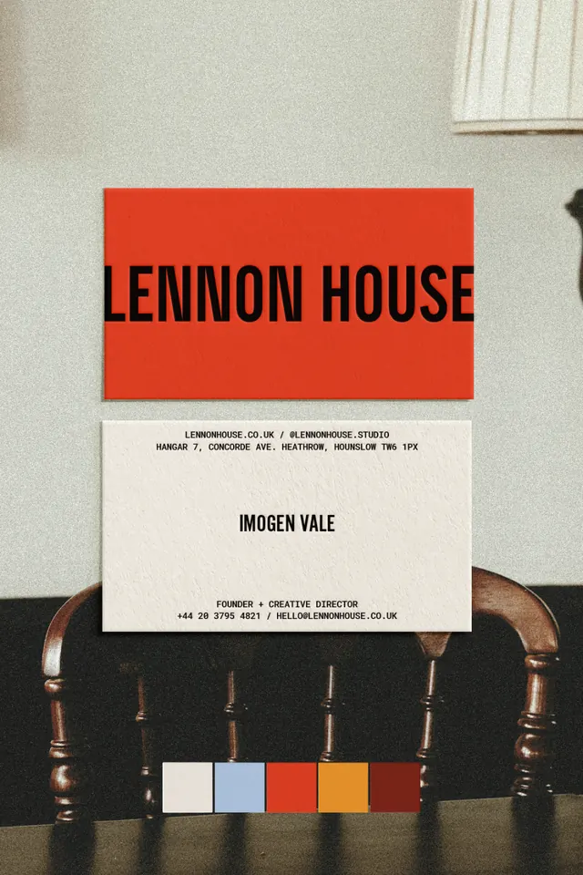
Minimalist editorial business card design pairing a bold red header block with an understated cream footer, plus a detached color palette reference below.
Summary
A formal business card showcasing a bold burnt-red type header above contact information on cream stock, with a discrete color palette swatch mounted below on a wooden block.
Visual description
A two-part printed system: the card above shows all-caps sans-serif type (name "LENNON HOUSE") in black against a prominent burnt-red rectangular block, with smaller contact details and studio information below in dark type on cream. A second card sits below, displaying the brand palette as five discrete color swatches stacked horizontally in warm, earthy tones: off-white, pale blue, burnt-red, golden-orange, and deep red. The entire system is held up on a wooden block with turned legs, emphasizing the physicality and craft of the identity.
Key takeaway
The economy of the two-tier card system; the impact of a bold colored block used as a structural header rather than applied texture; the restraint in pairing just five palette colors, mounted separately to showcase intentionality; the serif-free, clean typography that contrasts the warmth of the color.
Reuse notes
Strong for design studios, creative practices, and luxury services where identity craft signals quality. The separate palette swatch is memorable and works well in portfolios or presentations. The warm but grounded palette reads as sophisticated without trend-chasing. Translates well to stationery suites and environment design.
More like this




Keep what you find
A free account saves references to boards and can send you a weekly email of picks based on what you save.
To see every result, go Pro.