Preview image. Unlock full-res
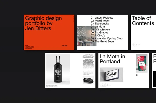
Graphic design portfolio cover spread with bold orange cover panel, listing projects in a structured grid format alongside product and publication mockups.
Summary
A portfolio cover layout featuring a vivid orange panel with project title and designer name, paired with a three-column grid of mockups and project details on black and white panels.
Visual description
The spread opens with a bold left panel in solid orange (E43B10) bearing white sans-serif text: "Graphic design portfolio by Jen Ditters" and contact details in the corner. The center-right columns display a structured grid: a table of contents listing numbered projects (numbered 01-08), product photography showing a dark bottle on white, and publication spreads featuring the "La Mota" branding and product shot. The entire composition uses strict vertical and horizontal alignment, heavy black borders separating zones, and a monochromatic anchor in greys and blacks with the orange slice providing all color accent.
Key takeaway
The decisive use of a single loud color (the orange) to anchor an otherwise black-white composition. The rigid grid discipline that organizes disparate content types (text index, product shots, publication spreads) into one readable flow without decoration.
Reuse notes
Works for designer/creative portfolios and agency capabilities decks. Pairs well with photography of physical products or printed work. The scale and boldness demand real content; works less well for lightweight service listings.
More like this






Keep what you find
A free account saves references to boards and can send you a weekly email of picks based on what you save.
To see every result, go Pro.