Preview image. Unlock full-res
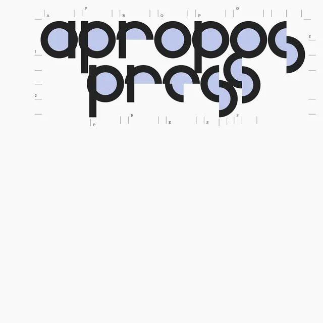
Stacked typographic mark with the word 'apropos' rendered twice in bold geometric sans-serif, with circular counter-spaces accented in pale blue.
Summary
A typographic wordmark stacking the word "apropos" in two lines using bold, geometric sans-serif characters with circular counter-forms highlighted in pale blue-gray against white.
Visual description
The word "apropos" is set in two stacked lines (four letters + four letters, with letterspace between for rhythm). The typeface is heavy, modern geometric sans-serif with uniform stroke width and large circular apertures. The top half of each circular counter-space is filled with a cool pale blue-gray (#BEC8EB), creating a bicolor effect that emphasizes the geometric structure. Fine measurement marks (vertical rules with letter designations A, P, R, O, S) are positioned along the top and bottom edges, evoking technical typography or printing specifications. The background is clean white. The overall composition is centered and occupies the full height.
Key takeaway
The clever use of selective color-fill inside counter-spaces to hint at the design system without compromising legibility. The reference marks framing the wordmark add a technical, editorial credibility. The stacked, geometric construction works equally well in monochrome or bicolor.
Reuse notes
Strong for brands in publishing, design, or technical fields. The measurement-mark detail reads as meticulous and data-aware. Works at display sizes; legibility diminishes below 48px due to the thin marks. Pair with a clean sans-serif for body text to extend the geometric language.