Preview image. Unlock full-res
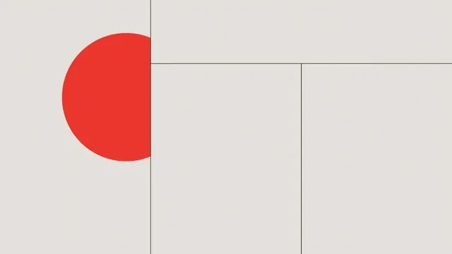
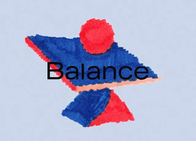
Monolithic logo with interlocking red and blue organic shapes that form a balanced, vertical composition, anchored by the word 'Balance' in black sans-serif.
Summary
A vertical stacking of bold, irregularly shaped color masses in bright red and saturated blue against a soft gray background, with the concept word "Balance" overlaid in black sans-serif type.
Visual description
Three organic, blocky forms stack vertically, anchored by a central horizontal mass that carries the text "Balance" in black sans-serif. The upper shape is a rounded rectangle of bright red; the middle, larger form mixes saturated blue with a thin band of warm peachy-pink across the center; the bottom element is another dark blue shape with a red triangular accent. The shapes appear loosely hand-rendered, with irregular, almost torn edges. A light gray-blue background provides breathing room, emphasizing the color-contrast contrast between the reds and blues.
Key takeaway
The direct color contrast approach (warm reds against cool saturated blues) holds all the visual interest without decoration; the loose, hand-drawn quality of the shapes lowers the formality while the geometric base keeps it contemporary; the vertical stacking creates inherent balance despite asymmetry.
Reuse notes
Works as a conceptual logo mark, a poster treatment, or a branding system kernel where the colors map onto brand values or product tiers. The style skews expressive rather than corporate, so best paired with brands in creative, tech, or lifestyle sectors that want contemporary edge. Colors are demanding and saturated, requiring careful application at small scale.