Preview image. Unlock full-res
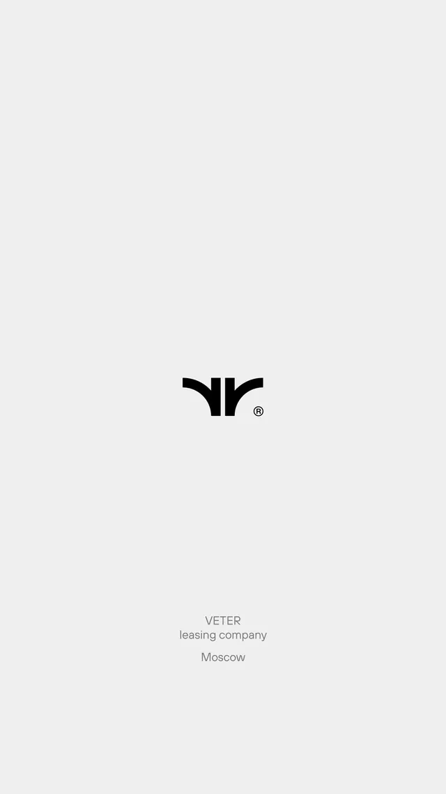
A minimal geometric wordmark for a leasing company, composed of two curved shapes forming a stylized 'V' with a registered trademark symbol.
Summary
A monochrome logo for Eter (a Moscow-based leasing company) using two opposing curved shapes to form a symmetrical mark, followed by supporting text identifying the company and location.
Visual description
Centered on a light gray background is a simple logotype: two black curved shapes positioned to mirror each other, resembling a 'V' or an open parenthesis facing outward, with a small registered trademark symbol to the right. Below the mark sits sans-serif text reading "ETER", then "leasing company" in smaller gray type, and finally "Moscow" at the baseline. The mark relies entirely on negative space between the curves and uses no filled forms, creating an open, airy aesthetic. The overall composition is vertically centered and symmetrically balanced.
Key takeaway
The use of paired curves creating a recognizable symbol through spacing rather than filled shapes makes the mark memorable and scalable. The registration mark adds a finished, professional touch. The supporting text hierarchy (brand name, descriptor, location) presents the company context clearly without cluttering the mark itself.
Reuse notes
Effective for B2B or financial-services branding where elegance and restraint signal trustworthiness. The open-curve approach works well when the brand wants to convey openness or fluidity. Scale this mark confidently to large sizes; the curved geometry remains legible and distinctive.