Preview image. Unlock full-res
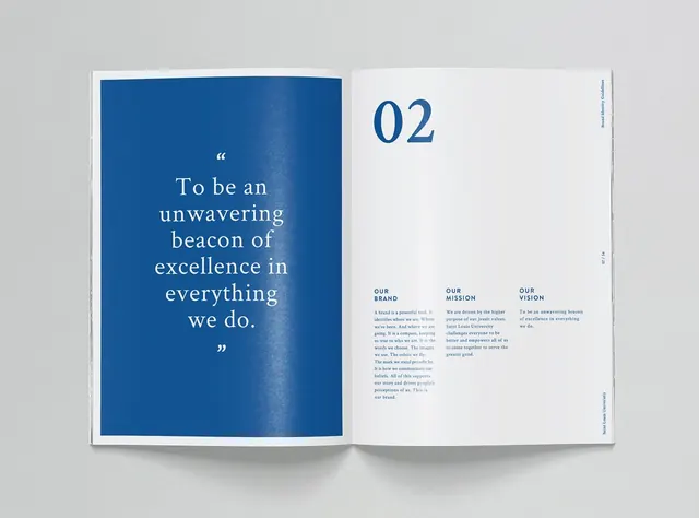
Saint Louis University brand guidelines spread: left page is a deep-navy block with a centered serif quote; right page has the section number 02 and three-column brand values text.
Summary
A two-page brand guideline spread for a university: the left page is a solid deep-navy rectangle with a centered serif-type mission quote; the right page is white with an anchored "02" section number and three-column definition blocks for "Our Brand," "Our Mission," and "Our Vision."
Visual description
Open book or brochure mockup against a light gray background. Left page is a solid deep-navy block occupying the full height, with white serif text centered: a quotation mark at top, then "To be an unwavering beacon of excellence in everything we do." with a closing quotation mark. Right page is clean white with large blue "02" flush to the top-right, followed by a body-text layout in three equal columns below. Each column has a small blue sans-serif header (all-caps) and five to six lines of small body copy in a neutral gray-blue. A thin vertical rule separates the columns. The binding gutter is left-aligned at the page edge.
Key takeaway
The full-height color block on one page as a device for containing inspirational or abstract content (mission, values, tone), leaving the opposite page clear and text-heavy for factual information. The large anchored section number as a chapter/flow marker that integrates with the color block. The three-column symmetry on the text page keeps information scannable and hierarchical. The serif/sans pairing (serif for the quote, sans for the headers and body) adds formality to the word choice itself.
Reuse notes
Essential framework for educational institutions, nonprofits, or consulting firms producing brand guidelines. The layout reads as serious and confident without being cold. The navy-and-white palette is institutional and trustworthy; adapt the color to your brand's primary. Works well at A4 or tabloid scale; the color block needs breathing room to feel deliberate rather than accidental.
More like this






Keep what you find
A free account saves references to boards and can send you a weekly email of picks based on what you save.
To see every result, go Pro.