Preview image. Unlock full-res
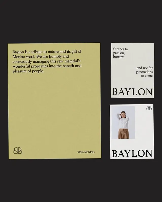
Ethical wool textile brand identity with butter-yellow material sample card, serif wordmark, and minimalist monogram linking raw material sourcing to finished product lifecycle.
Summary
Ethical textile brand that pairs a butter-yellow material sample card (left) with paired product cards (right) to tell a sourcing and sustainability story through tactile physicality.
Visual description
Dark background contains a composition of three printed pieces: a large butter-yellow card on the left with manifesto body copy describing 100% merino wool sourcing and conscious stewardship, featuring a dual-line monogram (overlapped "B" or concentric form) at lower left; on the right, two stacked narrow white cards bearing the serif wordmark "BAYLON" in tall capitals with an image of natural fiber or a product shot above it and another monogram placement. The serif typeface is traditional and refined. All typography is flush-left or center-aligned. Copy emphasizes the connection between raw material and finished garment as a multi-generational legacy.
Key takeaway
The use of physical card/sample format to embody a brand narrative about material sourcing. The butter-yellow (warm muted ochre) paired with black serif type and minimalist dual-line monogram creates both tactile and visual integrity. The stacking of information-dense copy on the left with product-focused cards on the right balances story and commerce.
Reuse notes
Strong for sustainable fashion, textile, or ethical-production brands needing to emphasize material transparency. Works particularly well when the visual identity can anchor in a signature warm or natural earth tone. Less suitable for luxury watch or jewelry brands where the object itself dominates; here the copy is equally important to establish trust.
More like this




Keep what you find
A free account saves references to boards and can send you a weekly email of picks based on what you save.
To see every result, go Pro.