Preview image. Unlock full-res
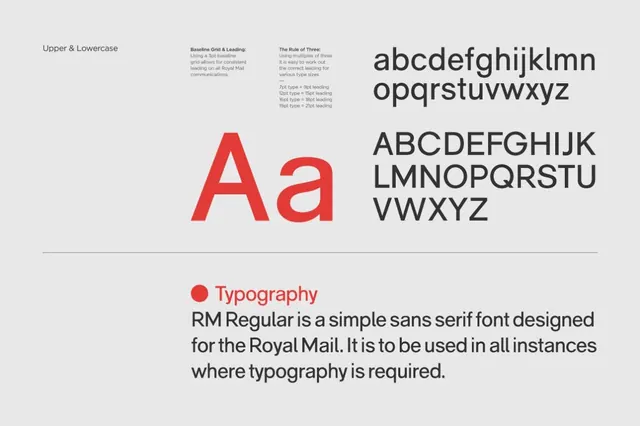
Brand typographic system for RM Regular sans-serif, documented with baseline-grid rules, leading ratios, and full character set.
Summary
Brand typographic system for RM Regular sans-serif, documented with baseline-grid rules, leading ratios, and full character set.
Visual description
A type specimen page displaying RM Regular, a straightforward sans-serif font designed for the Royal Mail. The page uses a light gray background and black text with accents of bright red. Upper left shows "Upper & Lowercase" labeling, followed by blocks of explanatory text on baseline grid, leading rules (7pt/9pt/12pt/16pt), and the rule of three. A dominant 200pt red capital A and lowercase a occupy the center-left, flanked by complete lowercase and uppercase character sets at 90pt on the right. The bottom third holds a red bullet point next to the heading "Typography" in gray, followed by a short brand statement in black body text. The layout uses generous whitespace and a clear typographic hierarchy.
Key takeaway
The systematic presentation of font metrics and leading rules in a formal, grid-based structure. The pairing of specimen sizes (large display, medium reference, small body) to show hierarchy and function at a glance. The use of a single accent color to highlight key information without visual noise.
Reuse notes
Ideal template for institutional or corporate brand guidelines where legibility and formal structure matter. The rule-of-three approach (7/9/12/16pt relationships) is particularly useful for regulated industries. Works best when the typeface has a restrained character like Royal Mail's design.
More like this









Keep what you find
A free account saves references to boards and can send you a weekly email of picks based on what you save.
To see every result, go Pro.