Preview image. Unlock full-res
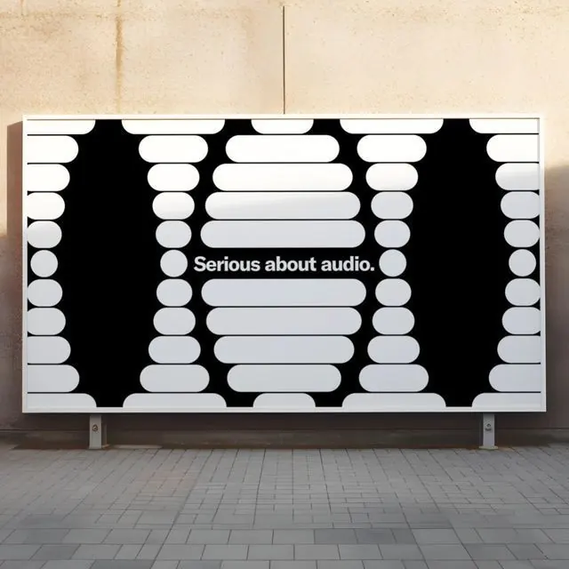
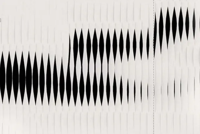
A high-contrast geometric identity pairing the phrase 'Serious about audio' with a repeating waveform or pill-shape pattern in black, white, and gray, positioned as an audio technology brand mark.
Summary
A dynamic audio-brand identity featuring the phrase "Serious about audio" centered within a geometric waveform pattern of stacked white and gray pill shapes, creating a sound-wave metaphor across a black background.
Visual description
Black background with centered white rectangular billboard showing a repeating vertical waveform made of white and light-gray rounded rectangles or pill shapes, arranged in symmetrical columns of three. The shapes are positioned to evoke an audio equalizer or sound-wave visualization. At center, sans-serif white text reading "Serious about audio." in regular weight, breaking the pattern slightly for emphasis. The composition is perfectly symmetrical along the vertical axis. The palette is strictly black-white-gray with no secondary colors. The waveform motif extends to the left and right edges, implying the pattern continues beyond the visible frame. The overall effect is clinical, precise, and modern, appropriate for audio software or podcast branding.
Key takeaway
The waveform metaphor is visually obvious and memorable: stacked rounded shapes immediately read as sound, frequency, or data flow without text. The symmetry and repetition create rhythm and system, and using only white and gray on black makes this instantly reproducible across media (screen, print, embossing, neon). The centered text positioning allows the geometric pattern to carry visual weight while the typography remains legible and secondary. The pattern is flexible: it could scale smaller for a logo mark or larger for a billboard or web background.
Reuse notes
Excellent for audio-focused brands: podcast networks, music software, audio engineering, or sound design studios. The geometric approach feels technical and trustworthy rather than artistic or acoustic. Works best when the brand benefits from a modern, digital-first aesthetic. Not suited to analog or vintage audio brands; the aesthetic is contemporary and precise. The repeating pattern is CPU-efficient for web animation or motion graphics applications.
More like this






Keep what you find
A free account saves references to boards and can send you a weekly email of picks based on what you save.
To see every result, go Pro.