Preview image. Unlock full-res
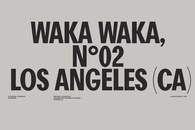
Minimalist type specimen showing a heavy sans-serif typeface in multiple weights, set across a neutral beige ground with functional design credits and a collection mark.
Summary
A no-frills typographic system poster for Waka Waka Collection No. 02, designed by Shin Okuda in Los Angeles. The heavy condensed sans-serif dominates the composition, anchored by small functional text crediting art direction, photography, and development.
Visual description
Beige-gray rectangular field filled with a single bold, high-contrast hierarchy. The nameplate "WAKA WAKA, N.02 / LOS ANGELES (CA)" occupies the upper three-quarters in a chunky, slightly condensed sans-serif rendered in deep charcoal gray. Three lines of 7pt credit text sit in the bottom left ("ART DIRECTION. PHOTOGRAPHY. DEVELOPMENT") and bottom right ("ALL RIGHTS RESERVED. 2008"), aligned left and right respectively. Simple rectangular frame lines enclose the nameplate area, reinforcing the functional graphic approach. No imagery or ornamentation.
Key takeaway
The economy of the composition: one typeface, two colors (beige and gray), credited explicitly. The weight and scale of the headline creates presence without any visual flourish. The frame lines add a subtle structural grid without becoming decorative.
Reuse notes
Effective for design studio or foundry promotions when you need a self-referential, austere identity. Works well for a type-forward brand or in an editorial / institutional context. Scale the type confidently and let the neutrals do the work.
More like this






Keep what you find
A free account saves references to boards and can send you a weekly email of picks based on what you save.
To see every result, go Pro.