Preview image. Unlock full-res
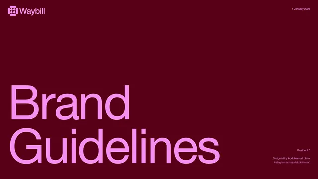
Waybill brand guidelines cover with oversized bright-pink typography set against a deep burgundy field, accented by the Waybill wordmark and gridded logo.
Summary
Waybill's brand guidelines title page presents oversized bright-pink typography reading "Brand Guidelines" stacked centered on a deep burgundy ground, with the Waybill wordmark and gridded icon in white at top-left.
Visual description
A full-bleed burgundy background (#580017) occupies the frame. In the upper-left corner, the Waybill logo appears as a small pink wordmark paired with a pink square containing a gridded pattern. The main typography, rendered in a sans-serif display face with a slight outline or stroke, reads "Brand Guidelines" in two stacked lines at large scale (approximately 40-50% of the frame height), positioned left-aligned in bright neon pink (#FE95FA). The right side of the frame is empty negative space. At the bottom-right corner, metadata appears in white: "Version 1.0", "Designed by Abdulsamad Umar", and an Instagram handle. The composition is deliberately austere, letting color and typography carry all visual weight.
Key takeaway
The fearless pairing of a high-saturation neon pink against a deep, nearly black burgundy creates maximum contrast with minimal elements. The oversized typography approach allows the typeface itself to be the design, avoiding the need for decorative patterns or imagery. This restraint makes the guidelines document feel premium and confident rather than decorative.
Reuse notes
Effective for fintech, legal, or B2B brands seeking to project confidence and clarity. The color pairing reads as both modern and professional; use this for brand identity guidelines, title pages, or hero sections in corporate decks. The high contrast ensures legibility at any scale. May feel cold or corporate without supporting imagery; pair with photography or detailed patterns in secondary pages to balance visual impact.
More like this


Keep what you find
A free account saves references to boards and can send you a weekly email of picks based on what you save.
To see every result, go Pro.