Preview image. Unlock full-res
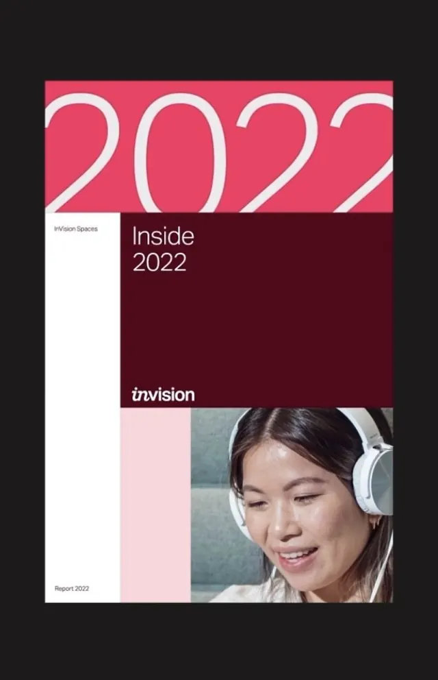
Report cover splitting bright coral top (oversized \"2022\" numerals) and structured bottom (deep maroon panel with serif logo, portrait, and white side panel with text).
Summary
An annual report cover for InVision Spaces (2022) with three distinct zones: bold oversized coral year numerals at top, lower split into a white information column and maroon content panel with serif branding and portrait photography.
Visual description
Top third: coral/hot-pink background (#E64564) filled with large white numerals "2022" in a rounded sans-serif, positioned to bleed off the right edge. Bottom two-thirds split vertically into left and right sections. Left section: white background with small "InVision Spaces" label at top in gray sans-serif and "Report 2022" at bottom, leaving most space as negative white. Right section: deep maroon background (#4E0A19) with right-aligned white italic serif logo reading "inVision" and below it a color photograph of a smiling woman wearing white over-ear headphones, head and shoulders composition, well-lit indoor studio setting. The portrait is cropped and positioned to sit in the lower right quadrant of the maroon panel.
Key takeaway
The three-zone hierarchy (dynamic numeral zone, quiet text zone, rich content zone) avoids monotony while maintaining clarity. Using color to separate information type (coral for year, maroon for brand identity, white for metadata) creates instant scanning order. The italic serif "inVision" against the maroon is sophisticated and anchors the lower half. Negative white space on the left balances the photo-heavy right, preventing visual crowding.
Reuse notes
Strong for corporate or nonprofit annual reports, especially when the report year or key message is the focal point. The split-white-and-color approach works well when you have a strong brand color and a portrait or hero image to showcase. The serif logo style reads premium and editorial, suitable for publishing, research institutions, and media companies. Avoid if imagery is weak; this design gives photography considerable visual prominence.
More like this




Keep what you find
A free account saves references to boards and can send you a weekly email of picks based on what you save.
To see every result, go Pro.