Preview image. Unlock full-res
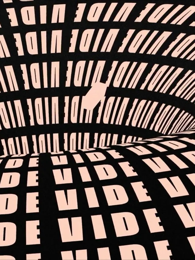
Repeating VIDE letterforms arranged in a radial perspective grid that warps toward a vanishing point, creating a hypnotic kinetic-art effect in peachy pink on black.
Summary
The word VIDE repeats in condensed, all-caps sans-serif within a geometric grid that radiates outward from a central vanishing point, creating a tunnel-like optical illusion in bright peachy pink against solid black.
Visual description
Black background entirely filled with repeating letterforms in a perspectival arrangement. The letters curve and compress as they recede from center, mimicking radial depth. The typeface is geometric, bold, and monospaced, sitting inside rectangular cells that follow the grid's curvature. Peachy-pink positive letterforms create high contrast against the black void. The grid structure itself acts as an organizing armature, with curved horizontal dividers wrapping around the vanishing point at the image center. The perspective effect pulls the eye inward, creating kinetic motion despite the static composition.
Key takeaway
The radial-grid structure itself is the payload: it works at any typeface size and can swap words, logos, or symbols. The simple two-color palette (black and one warm accent) maximizes contrast and legibility across the warped space. The repetition of the word creates rhythm while the perspective distortion generates visual tension.
Reuse notes
Effective for posters, book covers, or promotional graphics where motion and optical depth are desired without animation. Works best with short, condensed words or icons. The high contrast reads clearly at small scales. Avoid on busy backgrounds; the design demands visual isolation.
More like this

Keep what you find
A free account saves references to boards and can send you a weekly email of picks based on what you save.
To see every result, go Pro.