Preview image. Unlock full-res
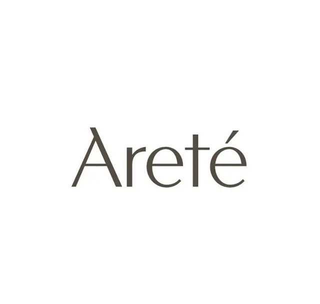
Centered wordmark for 'Areté' rendered in a thin, geometric sans-serif on white background, emphasizing restraint and refinement.
Summary
Areté rendered as a centered wordmark in a light-weight, geometric sans-serif against pure white space, exemplifying luxury minimalism through typographic discipline alone.
Visual description
The word "Areté" is set in a thin, geometric sans-serif font with uniform stroke weight and slightly tapered terminals. The typography occupies the vertical center of a white background with abundant negative space above and below. The letterforms are airy and open, with clean edges and consistent proportions. No decorative elements, illustration, or color variation, relying entirely on typeface weight and spacing for visual impact.
Key takeaway
The power of a single, well-chosen typeface set at scale with generous margins. Geometric sans-serif letterforms paired with ample white space signal sophistication and high-end positioning without ornament. The centered, vertical composition creates focus and dignity.
Reuse notes
A strong reference for luxury brands, premium services, or identity systems prioritizing understatement. Works best when the typeface choice is distinctive; otherwise, consider pairing with a secondary mark or color accent. Requires confident brand awareness to succeed without additional visual support.
More like this

Keep what you find
A free account saves references to boards and can send you a weekly email of picks based on what you save.
To see every result, go Pro.