Preview image. Unlock full-res
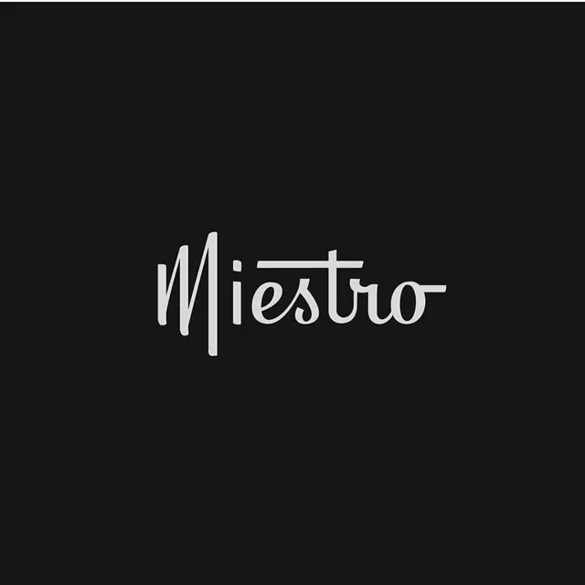
A custom 'Miestro' wordmark drawn in a connected retro script, set off-white and small against a large near-black field that swallows it in negative space.
Summary
A custom "Miestro" logotype drawn as connected retro script, with the capital M and a long horizontal stroke off the "t" tying the word together. It floats small and off-white in the middle of a large near-black square.
Visual description
The wordmark is the only element on a flat charcoal-black ground. Lettering is a hand-built script: an upright capital M with a curling left stem, lowercase letters that join in a continuous flow, and a single extended crossbar springing from the "t" that runs back over the word like an underscore-above. The stroke weight is even and fairly fine, more drawn than typeset, giving a vintage signage feel rather than a clean geometric sans. The mark sits dead center and occupies only a fraction of the canvas, so the surrounding black does most of the compositional work.
Key takeaway
The single extended stroke that ligatures across the whole word is the move: one long flourish turns a row of letters into a unified mark. Pairing it with a vast empty black field makes a small logo feel deliberate and premium instead of lost.
Reuse notes
Good starting point for a hospitality, salon, music, or boutique-product wordmark that wants warmth without going fully ornamental. The light-on-dark, lots-of-air treatment suits a splash screen, profile avatar, or stamp. Keep it monochrome; adding color would cheapen the restraint. Custom-drawn, so it is not a font you can re-set, it needs redrawing to extend.
More like this

Keep what you find
A free account saves references to boards and can send you a weekly email of picks based on what you save.
To see every result, go Pro.