Preview image. Unlock full-res
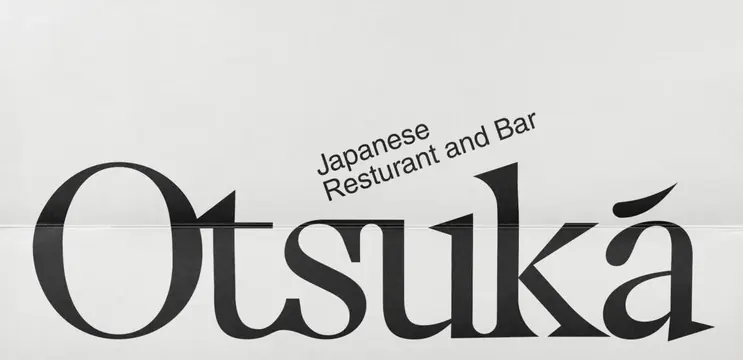
Oversized serif wordmark for Otsuka, a Japanese restaurant and bar, with a secondary descriptor above the main mark in a lighter serif.
Summary
Sophisticated restaurant logotype setting the oversized serif wordmark "Otsuka" over a horizontal line, with secondary descriptor text "Japanese Restaurant and Bar" positioned above in a smaller, lighter serif.
Visual description
A centered typographic logo composition on a neutral light gray background. The primary mark is the word "Otsuka" rendered in an oversized, high-contrast black serif typeface with generous letterforms and moderate stroke contrast. The letters are separated by a horizontal line running through the middle of the text at x-height, creating a visual division that reads both as a type treatment and a compositional frame. Above the line sits the descriptor "Japanese Restaurant and Bar" in a noticeably smaller, thinner serif weight. The overall layout is vertically centered and symmetrical, emphasizing refinement and clarity.
Key takeaway
The horizontal line device that divides the primary logotype from the descriptor, creating visual hierarchy without requiring color, size alone, or additional symbols. The geometric serif typeface that conveys both contemporary aesthetics and authentic fine-dining credentials. The generous spacing and refined letterforms that suggest quality and care.
Reuse notes
Strong template for upscale hospitality brands, particularly where a secondary tagline or descriptor is needed. The serif treatment works especially well for traditional cuisines or established, premium venues. The horizontal line can be adapted as a secondary brand element or navigation divider in extended applications. Works best when paired with high-end photography and generous whitespace.