Preview image. Unlock full-res
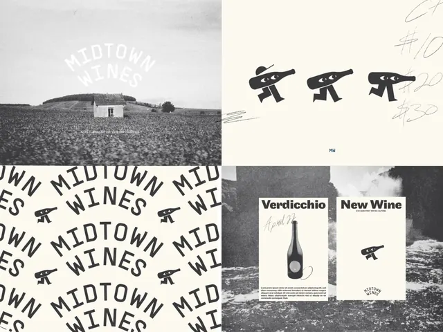
Wine brand identity combining black-and-white landscape photography, a reusable geometric bottle-and-telescope icon, and bold distressed typography arranged in repetitive patterns and modular layouts.
Summary
Wine brand identity combining black-and-white landscape photography, a reusable geometric bottle-and-telescope icon, and bold distressed typography arranged in repetitive patterns and modular layouts.
Visual description
Top-left quadrant shows a black-and-white landscape photograph, a vast field with a distant hill or building silhouette and "MIDTOWN WINES" stamped in large serif or slab capitals in white, nearly translucent. Top-right zooms in on a repeating icon system: three identical geometric marks showing a bottle shape with horizontal lines crossing it (suggesting a telescope or scope), rendered as bold black silhouettes with small notches or decorative marks. Center-left displays a dense repetition pattern of "MIDTOWN WINES" in condensed, distressed sans-serif, stacked and overlapping to create a textile or wallpaper effect. Bottom-right shows two applied layouts: one card-style composition labeled "Verdicchio" with a wine bottle photographed against a beige paper background, paired with hand-written annotation; the other a stark layout with "New Wine" text and the bottle-telescope mark, set against a black-and-white landscape crop. Hand-drawn underlines and directional marks (dashes, hatch lines) accent the composition.
Key takeaway
The bottle-telescope icon is bold, recognizable, and infinitely reusable across mediums. The distressed-typography repetition (wallpaper treatment) gives artisanal authenticity while staying modular. Pairing black-and-white photography with stark graphic marks creates memorable contrast and versatility. The system shows both tight, pattern-driven layouts and open, breathing card formats, demonstrating scalability.
Reuse notes
Excellent reference for wine, craft beverage, or artisanal food brands seeking premium yet approachable aesthetics. The monochrome approach works across print, packaging, and digital. The icon system is compact enough for small applications (labels, web icons) and impressive enough for larger formats. The hand-drawn accents feel authentic without being cluttered. Landscape photography as a brand anchor pairs well with beverages and heritage stories.
More like this

Keep what you find
A free account saves references to boards and can send you a weekly email of picks based on what you save.
To see every result, go Pro.