Preview image. Unlock full-res
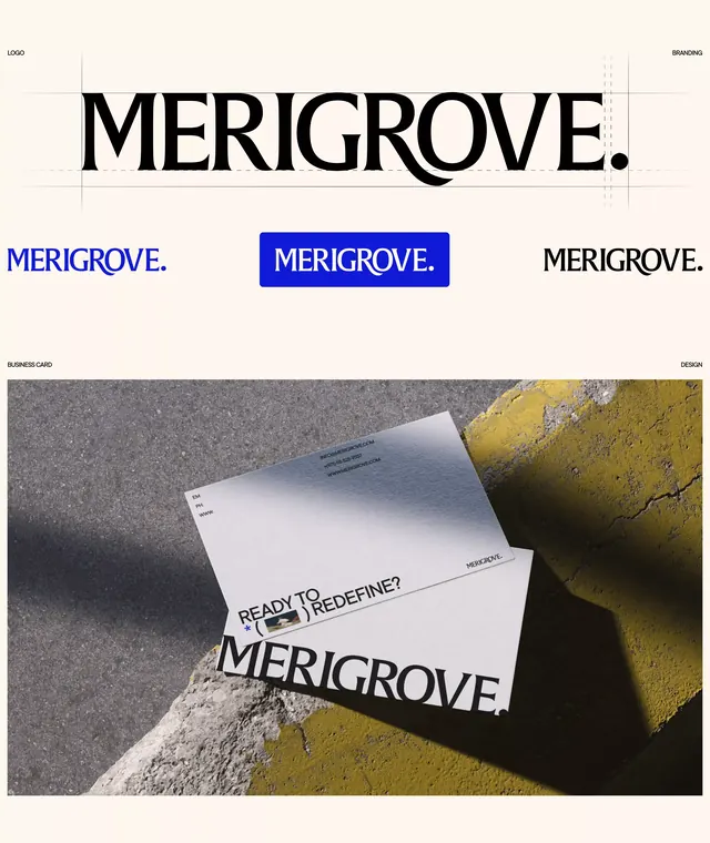
Serif wordmark system paired with brutalist typography and raw mineral/textile photography, conveying serious, grounded premium positioning.
Summary
A minimalist brand identity system featuring a serif wordmark paired with three typographic variations, grounded in photography of raw mineral and textile surfaces accompanying the tagline "Ready to redefine?"
Visual description
The primary wordmark "MERIGROVE." uses a refined serif typeface with deliberate weight and presence. Below sit three wordmark treatments: one in blue on white (solid brand color), one in white reversal, one in black. Each uses the same serif family at consistent weight and spacing. The lower section features photography of raw materials - textured stone, crumpled metal, ochre-tinted surfaces - anchoring the identity in tactile, industrial sensibility. The photographic palette of greys, whites, blacks, and earthy ochres echoes the typographic palette. Typography remains the dominant design element throughout.
Key takeaway
Pairing a single serif typeface across multiple colorways creates system coherence without pattern or icon variation. Raw material photography (grout, stone, oxidized metal) conveys authenticity and seriousness without being cold. The typography-first approach with supporting photography keeps hierarchy clear and brand presence strong across applications.
Reuse notes
Well-suited to premium brands in sustainable goods, design services, or materials-driven industries. The monochromatic approach translates cleanly to digital, print, and environmental applications. Works effectively at large scales (signage) and small (tab lettering). The material photography gives texture without ornamentation, fitting modernist design sensibilities.
More like this





Keep what you find
A free account saves references to boards and can send you a weekly email of picks based on what you save.
To see every result, go Pro.