Preview image. Unlock full-res
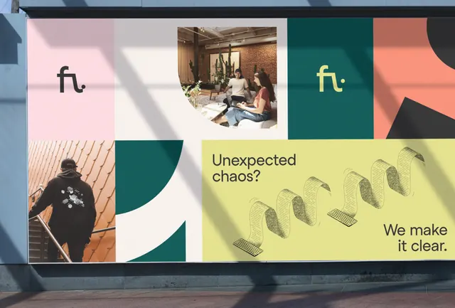
Multi-block logo suite using earthy sage, mustard, and pale blush rectangles on dark teal, suggesting a design consultancy brand.
Summary
A modular identity system for "ft." featuring a grid of colored rectangles (sage, mustard, pale blush) photographed on teal, with tagline "We make it clear" in sans-serif.
Visual description
The layout is a three-column grid, alternating photographic and color-block panels on a dark teal background. Left column: a cropped photograph of hands/product in warm light, shot from above. Center column: the "ft." logo treatment with a mustard-yellow rectangle and pale cream offset rectangle containing a photograph of an interior space. Right column: a sage-green rectangle topped with the tagline "We make it clear" in small sans-serif, with a warm coral/salmon rectangle below. The entire composition feels contemporary and editorial, balancing photography with restrained color blocking. All shapes have sharp edges and no rounded corners; spacing is geometric and deliberate.
Key takeaway
The use of photography and color as equal design elements within a modular grid system; the restraint of an earthy, analogous palette (sage, mustard, taupe, coral) that avoids oversaturation while remaining warm; the pairing of a minimal wordmark ("ft.") with a clear tagline that articulates the brand promise; the modular structure that allows for flexible layouts and future adaptability.
Reuse notes
Excellent reference for design studios, creative agencies, or contemporary consulting firms. The modular approach scales to business cards, websites, and environmental design. Works best paired with photography; ensure images have consistent lighting and mood to maintain cohesion. The muted earth tones suggest craft and sophistication suitable for high-end positioning.