Preview image. Unlock full-res
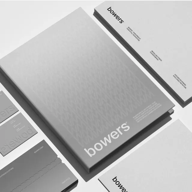
Corporate identity for Bowers rendered in monochromatic grays with lowercase sans-serif and isometric stationery composition.
Summary
Corporate identity for Bowers rendered in monochromatic grays with lowercase sans-serif and isometric stationery composition.
Visual description
An isometric mockup of stationery collateral arranged on a white field: a fold-out mailer booklet, business cards, envelopes, and single-page sheets, all in varying shades of gray (from near-white to charcoal). Each piece displays "bowers" in clean, lowercase sans-serif at different scales and positions. Subtle surface textures suggest fine paper stock. The diagonal camera angle creates depth; pieces overlap to imply a complete system. Small text blocks (contact info, service categories) are legible only as texture from this view, emphasizing the system's graphic cohesion over content.
Key takeaway
The isometric perspective unifies disparate stationery items into a single visual story without flattening them; overlapping planes suggest a curated set. The exclusive use of gray tones across all pieces reinforces a unified brand language. Condensed, lowercase sans-serif feels modern and restrained without being cold.
Reuse notes
Works for design studios, architecture firms, and agencies wanting to project sophistication and craft. The monochromatic treatment photographs and prints reliably. The isometric view is excellent for portfolios and pitch decks; in production, ensure each collateral item stands alone clearly.
More like this



Keep what you find
A free account saves references to boards and can send you a weekly email of picks based on what you save.
To see every result, go Pro.