Preview image. Unlock full-res
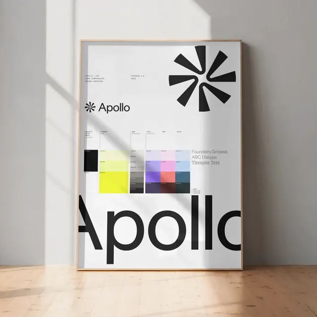
A minimalist brand identity system featuring the name 'apollo' in sans-serif type paired with a black rayed star symbol, with color and typography documentation on a cream card.
Summary
A minimalist brand identity system featuring the name 'apollo' in sans-serif type paired with a black rayed star symbol, with color and typography documentation on a cream card.
Visual description
A white card leans against a neutral gray wall, displayed in a wood frame. The card is dominated by the word 'apollo' in lowercase sans-serif and a geometric star symbol composed of twelve thick black rays emanating from a central point. Below the wordmark sits a color grid showing a palette of warm neutrals and muted earth tones: cream, gray, warm beige, taupe, and dark brown. Typography information is listed in small sans-serif text, documenting the typeface used and its variations.
Key takeaway
The star symbol is remarkably economical—simple geometry but instantly recognizable. Using it as the primary mark alongside the wordmark creates instant brand consistency. The restrained neutral palette and mono geometric forms read as sophisticated and trustworthy without being cold. Documenting the complete system on a single artifact makes it easy to communicate to partners.
Reuse notes
Perfect for professional services, tech, or portfolio brands where clarity and minimalism signal expertise. The geometric star can scale from app icon to signage. The warm-neutral palette differentiates from typical tech grays while remaining professional. Best deployed at generous scale; the fine ray proportions risk muddying at very small sizes.
More like this




Keep what you find
A free account saves references to boards and can send you a weekly email of picks based on what you save.
To see every result, go Pro.