Preview image. Unlock full-res
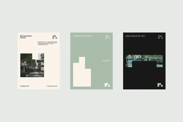
Real-estate identity system with three color-variant treatments: cream and architecture on white, muted sage with geometric abstraction, and dark with paired property photography.
Summary
Three-color-variant identity system for a Russian real-estate brand, each card showing the logo lockup, property photography, descriptive tagline, and modular geometric symbol in cream, sage, and charcoal backgrounds.
Visual description
Three vertically oriented cards present a consistent identity system across distinct color palettes. The left card uses cream background with dark sans-serif typography. A crop of a contemporary residential building anchors the lower half; smaller text explains the brand's positioning. A small geometric mark appears at bottom right. The center card applies muted sage green with white typography reversed out; a cream-colored abstract geometric form occupies the center space, paired with a small accent mark at the bottom. The right card inverts to dark charcoal with white text and two horizontal strips of architectural photography showing modern homes with landscaping. Each variant includes the brand wordmark top right and maintains consistent spacing and typographic hierarchy across the modular system.
Key takeaway
The three-variant approach lets one identity span different communication contexts without redesign. The geometric mark (same across all versions) becomes a visual anchor that works in any color. Photography and negative space do the contrast work, keeping layouts breathable even when backgrounds shift.
Reuse notes
Ideal for development or property brands needing credibility with design refinement. Sage-and-cream combo pairs well with warm photography; works on its own for guideline pages. The proportions assume a card or poster size, not web.
More like this




Keep what you find
A free account saves references to boards and can send you a weekly email of picks based on what you save.
To see every result, go Pro.