Preview image. Unlock full-res
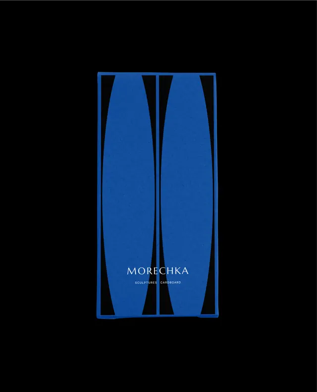
A type specimen showcasing a sans-serif face with two symmetrical curved blue shapes framing the brand name against black.
Summary
Tall, curved blue forms frame the Morechka brand name centered on black, demonstrating restrained geometry and high contrast as core identity moves.
Visual description
Pure black background with two mirrored, elongated teardrop or bulbous shapes in bright cobalt blue. The shapes bow inward subtly, creating a tall rectangular frame. Centered within: the wordmark "MORECHKA" in white sans-serif caps, with a smaller line of text underneath (sub-copy in lighter weight). The design is strictly symmetrical along a vertical axis. The negative space is generous and deliberate. No borders or embellishment beyond the two shapes.
Key takeaway
The restraint of using just two pure colors (black, bright blue, white) to anchor the entire composition. The curved architectural framing trick, which draws the eye inward without any hierarchy shifts or decoration. The decision to let the brand name breathe in the center rather than fill the space.
Reuse notes
Strong for luxury or editorial contexts that prize understatement and craft. Works at any scale because the geometry is so clear. Works particularly well when the audience appreciates minimal, gallery-like presentation. Less suited to friendly or playful tones.
More like this


Keep what you find
A free account saves references to boards and can send you a weekly email of picks based on what you save.
To see every result, go Pro.