Preview image. Unlock full-res
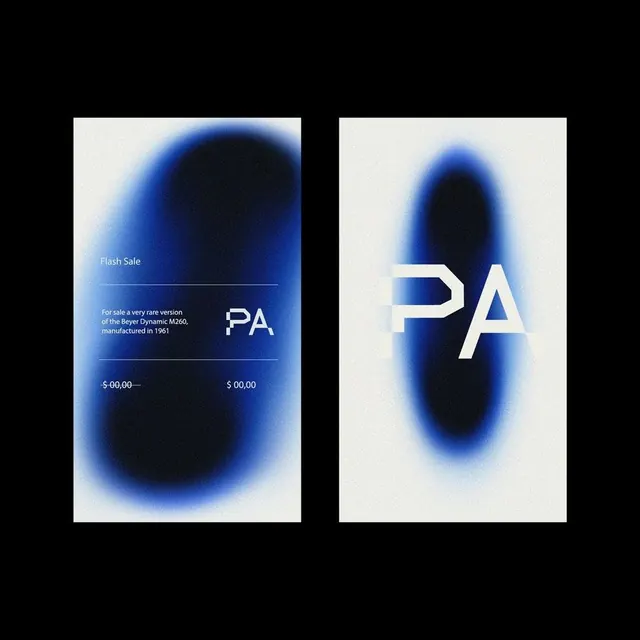
Minimal brand identity pairing a sharp sans-serif logotype with a dramatic radial indigo-to-black gradient that commands visual hierarchy.
Summary
Minimal brand identity pairing a sharp sans-serif logotype with a dramatic radial indigo-to-black gradient that commands visual hierarchy.
Visual description
Two vertical compositions shown side-by-side. The left panel features text reading "Flash Sale" with product details and pricing in light gray, anchored by a sharp "PA" monogram in white sans-serif. The right panel isolates the "PA" logotype, enlarging it to fill the space. Both compositions use a large radial gradient background: a soft cream-to-white perimeter blurs into a concentrated core of deep indigo and black. The gradient creates an egg-shaped or oval vignette effect, with the darkest area positioned behind the letterforms. Typeface is geometric, modern sans-serif; the "PA" letters are tightly spaced and vertically stacked.
Key takeaway
The radial gradient backdrop creates depth without additional graphic elements. The logotype remains readable at small sizes despite the intense background. The two-up presentation format (context + isolated mark) works for marketing assets or guideline documentation.
Reuse notes
Strong for luxury brands, premium tech products, or editorial design systems. Works best when the primary color palette is cool and deep; the high contrast demands bold, light-colored type. The gradient can read as overly theatrical if overused across many applications.
More like this
Keep what you find
A free account saves references to boards and can send you a weekly email of picks based on what you save.
To see every result, go Pro.