Preview image. Unlock full-res
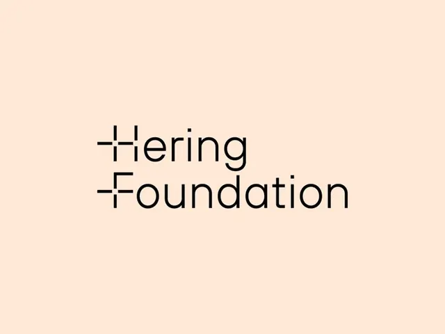
Warm, minimal type specimen for Hering Foundation with a geometric sans-serif featuring integrated cross strokes in letter construction.
Summary
A warm, minimal type specimen for the Hering Foundation featuring a geometric sans-serif typeface with integrated cross strokes as structural elements in its letterforms.
Visual description
Centered text reading "Hering Foundation" in a geometric sans-serif against a warm peachy-beige background. The typeface features distinctive cross-stroke details integrated into the H and F letters, creating a structural visual rhythm. The composition uses generous whitespace and precise letterform construction, with dark charcoal text providing strong contrast against the warm ground. The overall treatment is understated and composed, emphasizing the font's clean geometric construction and typographic clarity.
Key takeaway
The integration of geometric marks (cross strokes) as integral letterform details rather than decorative overlays; the use of a warm, neutral palette (cream and charcoal) to let typography be the primary visual; the controlled, centered composition that frames the type specimen for maximum legibility and impact.
Reuse notes
Effective for nonprofit, cultural, or foundation branding that needs a modern, legible typeface specimen. Works well in contexts where typographic precision and warmth are equally important. The geometric letterform details add visual interest without sacrificing readability or minimalist aesthetic.
More like this




Keep what you find
A free account saves references to boards and can send you a weekly email of picks based on what you save.
To see every result, go Pro.