Preview image. Unlock full-res
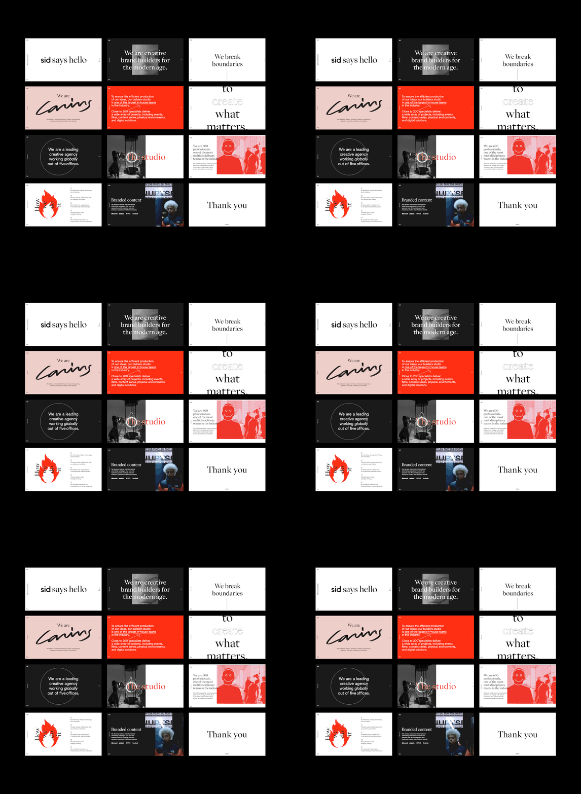
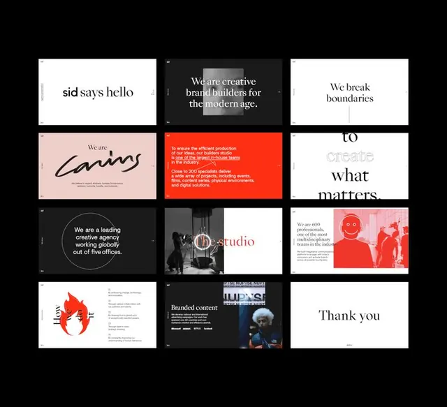
A multi-slide brand presentation showcasing a creative agency identity through bold color blocking, geometric line art, and confident sans-serif display type across 12 distinct vignettes.
Summary
A creative agency identity system presented across 12 slides, built from bold color blocks, geometric line illustrations, and assertive sans-serif headlines that shift between white, dark, red, and pink backgrounds.
Visual description
The sequence shows: a white slide with "sid says hello" in black serif; a dark slide with "We are creative brand builders for the modern age" over an image block; a white slide with "We break boundaries"; a pink slide with "caring" in a large flowing script over agency descriptor text; a bright red slide with white sans-serif body copy about production capabilities; a white slide split vertically with "to create what matters"; a dark slide with a circular border containing "We are a leading creative agency working globally out of five offices"; a dark/white split showing "studio" wordmark over black photography; a pink slide with "We are 600 professionals" paired with red-tinted photography and illustrated smiley faces; a white slide with large stylized flame-like mark; a dark slide with "Branded content" text; and a final white slide with "Thank you." Color palette alternates deliberately between high-contrast black-and-white, hot red, and soft pink across the sequence. Typography emphasizes large, confident display faces with occasional script for contrast.
Key takeaway
Bold, contrasting color blocking per slide creates visual rhythm and keeps the viewer engaged across a longer deck. Mixing serif display type with clean sans-serif body text, plus occasional script elements, avoids monotony while staying professional. The geometric line illustrations (flame marks, circles, the "caring" script treatment) add personality without diluting the corporate authority.
Reuse notes
Ideal for creative agencies, design studios, and marketing firms pitching their identity or capabilities. Works well for pitch decks, internal brand documents, or client presentations where you want to balance professionalism with creative confidence. The color blocking pattern is easy to adapt to different industry accents.
More like this




Keep what you find
A free account saves references to boards and can send you a weekly email of picks based on what you save.
To see every result, go Pro.